
Table of Contents
TLDR
An in-depth look at Steve Krug’s “Don’t Make Me Think” emphasises its importance in the UX/UI design field. It outlines Krug’s fundamental principles, such as intuitive navigation, the significance of clarity, and the necessity of simplifying choices for users to enhance their web browsing experience.
It also touches upon conducting practical usability tests, addressing advanced usability topics, and Krug’s lasting influence on web design. The piece concludes by reflecting on the evolution of web design principles and how Krug’s ideas remain relevant and influential in modern design practices.
Introduction to ‘Dont Make Me Think’ by Steve Krug
As user experience (UX) and user interface (UI) design have become increasingly critical to digital success, Steve Krug’s “Don’t Make Me Think” stands as an essential text in the field. First gracing our shelves back in 2000, this book hasn’t just survived the rapid evolution of the internet; it has thrived, influencing generations of web designers and developers.

Looking at my Amazon account this evening, I first purchased this book in 2007. I remember reading it from cover to cover in under 2 hours and thinking I did not learn anything. I re-read it that same day and soon realised that although I knew these principles intellectually, I wasn’t applying them in practice. This moment of clarity hit me hard, and ever since that day, I’ve implemented its teaching – re-reading as a necessary calibration every few years to ensure I’ve not dropped anything.
Here’s my take on why this book and its common sense approach to web usability remains an indispensable part of any UX/UI designer’s arsenal:
The Essence of Steve Krug’s Philosophy
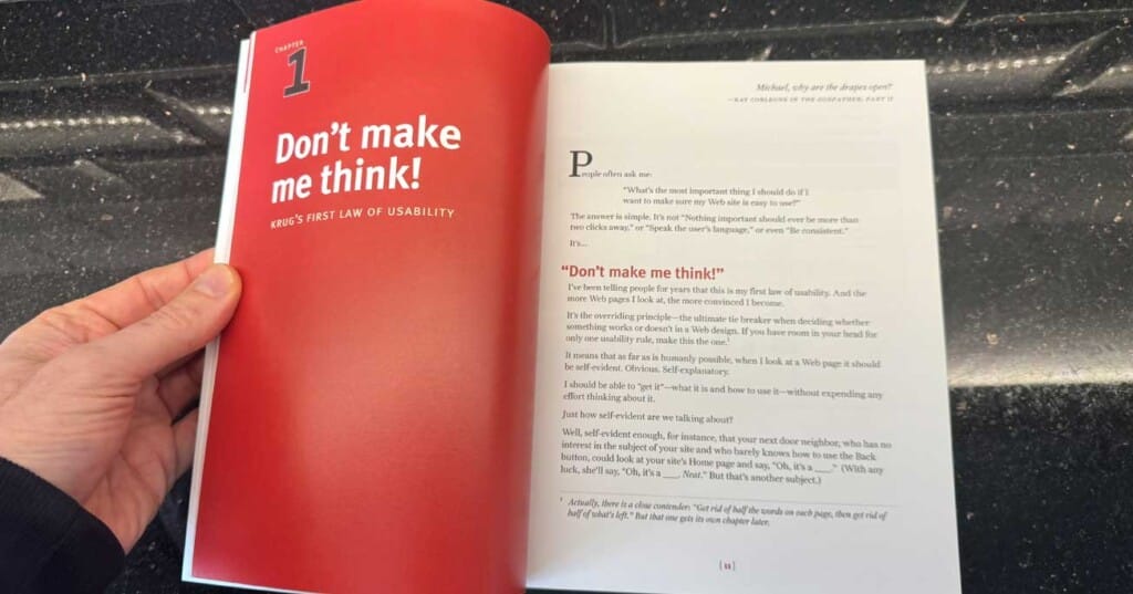
- Simplicity in Design: Krug’s core message revolves around the idea that the most effective websites and applications require the least cognitive strain from users.
- User-Centric Approach: He champions designing with the user in mind, advocating for intuitive navigation that feels almost second nature to the user.
The Premise of “Don’t Make Me Think”
- Intuitive Navigation: At the book’s core is that users should not have to ponder their next steps; a website should be as apparent as possible.
- Clarity Over Cleverness: Krug emphasises clear, straightforward communication. Websites should avoid puzzles or cryptic navigation that could frustrate or confuse them.
The Impact on UX/UI Design
- A Shift in Focus: ‘Don’t Make Me Think’ prompted a shift towards more user-friendly designs, pushing for ease of use over aesthetic or technological sophistication.
- Foundation for Modern Best Practices: Many guidelines and practices considered industry standards today can be traced back to Krug’s teachings.
In my experience, adopting Krug’s principles has been transformative. The emphasis on reducing cognitive load and making each user interaction feel effortless has fundamentally changed how I approach web design projects. It’s not just about making things look good; it’s about creating a seamless, intuitive user journey. “Don’t Make Me Think” isn’t just a book title; it’s a mantra for effective digital design that continues to guide and inspire.
• • •
The Core of Krug’s Philosophy
Steve Krug’s classic, ‘Don’t Make Me Think,’ outlines three core principles that form the foundation of effective web design. These principles aren’t just guidelines but essential ingredients for creating user-centric digital experiences.
Principle of Intuitive Navigation
Intuitive navigation is the cornerstone of Krug’s philosophy. The idea is straightforward yet profound: a website should be so intuitive that users can navigate it without stopping and thinking. This intuitiveness enhances user satisfaction and engagement by making digital interactions natural and effortless. How does one achieve this level of self-evidence in design?
- Consistency with Established Conventions: Aligning with web conventions reduces the learning curve for new users. Familiar patterns and symbols guide them intuitively towards their goals.
- Clear, Descriptive Labels and Links: Every link or button should communicate its function or destination, removing guesswork and enhancing navigation ease.
The Importance of Clarity
Krug’s emphasis on clarity cuts to the core of web usability and offers a fresh perspective. He advocates for eliminating superfluous words and focusing on essential content, thus improving readability and overall user experience. This principle is particularly crucial in an era of information overload, where attention spans are short, and clarity is the key to engagement. Here are some strategies inspired by Krug’s clarity principle:
- Prioritise Content: Distill your message to its essence. Remove jargon and fluff that might cloud your main points.
- Use Visual Hierarchy: Guide users through your content with headings, bullet points, and whitespace, making your site readable and scannable.
Simplifying Choices for the User
A central theme is simplifying user choices to enhance browsing experiences. By reducing the cognitive load on users, designers can create smoother, more enjoyable interactions with digital products. This doesn’t mean limiting functionality but streamlining the decision-making process. Here’s how:
- Limit Options: Too many choices can overwhelm users. Offer a curated set of options to simplify decision-making.
- Progressive Disclosure: Present only the necessary information upfront, revealing more options as needed. This approach keeps interfaces clean and reduces overwhelm.
In my experience, applying these principles has markedly improved the usability and appeal of the websites I’ve designed. By focusing on intuitive navigation, I’ve seen users accomplish their goals with less frustration and more satisfaction. Emphasising clarity has not only improved the accessibility of my designs but also communicated more effectively with the target audience. And by simplifying choices, I’ve noticed a decrease in user drop-off rates as decisions become quicker and less taxing.
• • •
Understanding User Behaviour on the Web
Understanding how users interact with websites is fundamental to crafting experiences that meet their needs and exceed expectations. Steve Krug’s observations in “Don’t Make Me Think” shed light on crucial user behaviours that have profound implications for web design. A good usability consultant should start by examining scanning patterns, ‘satisficing’ behaviour and the importance of managing user expectations; we gain insights into creating more effective and user-friendly websites.
Scanning Patterns
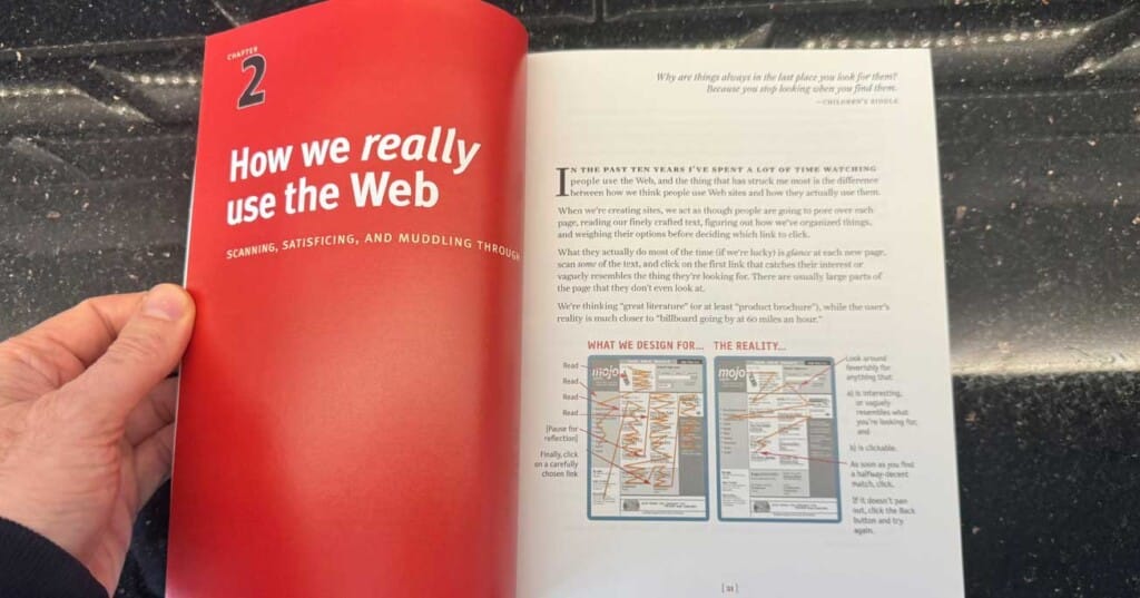
Users rarely read web pages linearly. Instead, they scan them for keywords, phrases, or visuals that interest them. This behaviour underscores designers’ need to organise content in a scannable layout. Effective use of headings, bullet points and highlighted keywords can guide users to the information they seek quickly. For example, eye-tracking studies have shown that users often scan in an ‘F’ pattern, focusing on the top and left side of the screen. Designers can leverage this knowledge by placing key information and navigation elements in these areas.
‘Satisficing’ Behaviour
Satisficing – a term combining “satisfy” and “suffice” – refers to how users often choose the first workable option rather than searching for the optimal one. This behaviour suggests that websites should be designed to present the most relevant information or actions in the most accessible manner. Simplifying decision-making processes by clearly labelling links and reducing the number of choices can significantly enhance user satisfaction. A case study of Amazon’s navigation redesign illustrates how categorising products into clear, easily navigable sections can reduce search time and improve user satisfaction.
Managing User Expectations
Managing expectations is crucial in web design. Users have preconceived notions about how certain elements should look and function based on their experiences with other sites. Deviating too far from these expectations can confuse users and lead to frustration. Consistency in design, adherence to web standards, and clear, concise messaging help align with user expectations. A study on website trust factors revealed that users are more likely to trust and continue using straightforward websites that are professional in appearance and consistent with other sites in the same category.
Implications for Web Design
Understanding these user behaviours has direct implications for web design. Sites must be designed with the user’s scanning habits in mind, ensuring that information is easy to find and understand. Navigation should be intuitive, allowing users to satisfy themselves effectively without missing out on important content or actions. Finally, managing user expectations through consistent, standard-based design builds trust and confidence in the site.
Practical Applications
Implementing these insights can transform the user experience. For instance, redesigning a website to highlight key products or services on the homepage with clear, descriptive headings can increase engagement. Simplifying forms and reducing the required fields can lower abandonment rates and increase conversions. Ensuring that your site’s design is in line with user expectations for your industry can enhance credibility and foster user loyalty.
• • •
Design and Usability Guidelines
For any web designer, designing for usability is a critical component in ensuring a web design or mobile app doesn’t just attract visitors but keeps them engaged.
Effective Web Navigation
The essence of intuitive site navigation lies in its ability to guide users effortlessly to their desired destination. It’s not just about having a menu; it’s about making that menu logical, predictable, and easy to use. This reduces cognitive load and bounce rates, as users find what they need without frustration. Here’s how:
- Simplicity and Predictability: Keep navigation elements simple and in expected locations. Users shouldn’t have to hunt for the menu or guess what each link does.
- Consistency Across Pages: Ensure that navigation elements remain consistent throughout the site. Changing formats or positions can disorient users.
- Descriptive Labels: Use clear, explanatory labels for navigation links. Avoid jargon or creative titles that confuse users about where a link leads.
Optimising the Home Page
The home page serves as the front door to your website. It’s often the first impression users have of your site, making its design crucial for engaging visitors and encouraging them to explore further. Compelling home page design involves:
- Clear Value Proposition: Immediately communicate the site’s purpose. Users should understand what your site offers and how it benefits them within seconds of arriving.
- Prioritized Content: Highlight the most crucial content or actions you want users to take. This could be featured products, services, or a call-to-action.
- Search Functionality: Include a visible search box to help users find specific information quickly, catering to those who prefer to bypass navigational menus.
Mobile Usability
With smartphones being the central digital touchpoint for most users, optimising Krug’s principles for mobile interfaces is essential. Mobile usability focuses on delivering a seamless experience that accommodates the constraints and advantages of mobile devices. Consider the following:
- Touch-friendly Design: Ensure buttons and links are easy to tap with a finger. Spacing and target sizes should account for touch navigation to prevent user errors.
- Simplified Layout: Given the limited screen real estate, prioritise content and features essential for mobile users. Hide or rearrange less critical elements to maintain a clean, uncluttered interface.
- Fast Load Times: Optimise images and scripts to ensure quick loading on mobile devices. Mobile users often rely on cellular data, which can be limited in speed and bandwidth.
Implementing these design and usability guidelines requires deeply understanding your users’ needs and behaviours. Regular testing and iterating based on user feedback is crucial. Remember, the goal is not just to make a site that looks good but feels intuitive and effortless, whether on desktop or mobile. By adhering to Krug’s principles and adapting them to today’s technological landscape, we can create digital experiences that users not only enjoy but return to time and again.
• • •
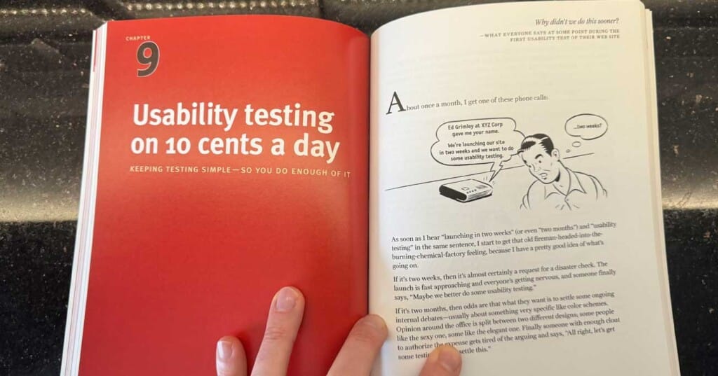
Usability Testing Simplified
His methodology is a do-it-yourself guide for designers at all levels. It emphasises that usability testing is essential and achievable without hefty budgets or elaborate setups.

Simplifying Usability Testing
His philosophy is grounded in the belief that watching real users interact with your site or application can unveil invaluable insights that designers might overlook. This user-centred approach helps refine and iterate designs in a way that truly resonates with the end user.
Conducting Effective, Low-Cost Usability Tests
Krug provides a blueprint for fixing usability problems by conducting practical, cost-effective usability tests that any design team can implement:
- Recruit Test Participants: You don’t need many—five users are often enough to identify key usability issues. Look for participants who match your target audience and invite them to your usability workshops.
- Prepare Test Scenarios: Create realistic scenarios that prompt users to interact with your site as they naturally would. Avoid guiding them too much to ensure genuine responses.
- Use Simple Recording Tools: Expensive equipment isn’t necessary. Essential screen recording software and a quiet room are sufficient.
- Observe and Take Notes: Focus on the user’s experience. Look for where they encounter difficulties or exhibit confusion.
- Iterate Based on Findings: Use the insights gained to make targeted improvements. Even minor tweaks can significantly enhance usability.
Krug’s approach to web usability demystifies usability testing, making it accessible for teams of any size and budget. The key takeaway is that regular, simple tests can provide the feedback loop necessary to create intuitive, user-friendly websites. By incorporating these low-cost usability tests into the design process, we can ensure our digital products are usable and truly resonate with our users’ needs and expectations.
• • •
Advanced Topics in Usability
In “Don’t Make Me Think,” Steve Krug delves beyond the basics of usability, touching upon advanced topics like accessibility, goodwill, and aesthetics, which are crucial for a holistic UX design strategy. These elements, while perhaps more nuanced, are advanced common sense that is integral to creating digital experiences that are usable, inclusive, engaging, and visually appealing.

Accessibility: A Pillar of Usability
Accessibility ensures that digital products are usable for everyone, including people with disabilities. Krug emphasises that designing for accessibility isn’t just about adhering to guidelines or regulations; it’s about empathising with all users and recognising the diversity of human experience. Incorporating accessibility features, such as alternative text for images, keyboard navigation and sufficient colour contrast, can significantly enhance the user experience for a broad audience, making digital spaces more inclusive.
Building Goodwill Through Usability
Goodwill in UX design refers to the positive feelings users develop toward a product or brand, often resulting from a seamless and satisfying user experience. Krug suggests that small, thoughtful design choices can accumulate goodwill. These include reducing user effort, providing clear and helpful error messages, and offering unexpected delights or easter eggs. Goodwill makes users more forgiving of minor inconveniences and more likely to recommend your product to others.
The Role of Aesthetics in Usability
While Krug primarily focuses on usability, he acknowledges the importance of aesthetics in creating effective web designs. A visually appealing interface can attract and retain users’ attention, contributing to a positive first impression and overall user satisfaction. However, aesthetics should not compromise usability. Striking the right balance between visual design and functional simplicity ensures that a website or app is beautiful but also intuitive and efficient.
These advanced topics underscore the complexity of UX design, reminding us that usability isn’t solely about making things easy to use. It’s also about creating experiences that are accessible, generate goodwill and please the eye—all of which contribute to a comprehensive UX design strategy that respects and values the user at every turn.
• • •
Krug’s Influence and Legacy

Since its publication over two decades ago, Steve Krug’s “Don’t Make Me Think” has undeniably shaped the landscape of web design and user experience (UX), leaving an indelible mark on the industry. Its core principles, emphasising usability, simplicity, and user-centric design, have stood the test of time and have become foundational elements of modern design practices.
Krug’s influence extends beyond the realm of design professionals. His accessible writing and practical advice have democratized UX design, making it understandable and actionable for developers, content creators, and business stakeholders. This widespread appeal has fostered a culture where good design and usability are valued across disciplines, contributing to a broader recognition of the importance of user experience in digital product development.
Moreover, the evolution of web design principles since the book’s publication highlights Krug’s ideas’ adaptability and enduring relevance. In an era dominated by mobile devices and an ever-increasing emphasis on accessibility, the principles outlined in “Don’t Make Me Think” have proven remarkably prescient. Designers are tasked with creating experiences that are not only visually appealing but also intuitive and accessible across a wide range of devices and user abilities. Krug’s advocacy for clear navigation, concise content, and eliminating unnecessary complexity has become increasingly pertinent as digital products and services become more sophisticated.
Reflecting on Krug’s legacy, it’s clear that his contributions extend beyond specific design tactics or methodologies. He has fundamentally influenced how we think about the user’s experience, advocating for a design approach that respects the user’s time and intelligence. While digital requirements and user expectations constantly evolve, Krug’s principles remain our North Star—emphasising simplicity, clarity and user focus as the keys to creating meaningful digital experiences that truly connect.
• • •
Conclusion
In wrapping up our exploration of Steve Krug’s “Don’t Make Me Think,” let’s distil the essence of his guidance into actionable takeaways and consider their enduring relevance in the ever-evolving field of digital design.

Key Takeaways from “Don’t Make Me Think”
- Intuitive Navigation: Design with the user’s instinct in mind; navigation should feel natural.
- Prioritise ease of use over aesthetic complexity.
- Use familiar patterns and clear labels.
- Clarity and Simplicity: Aim for unmistakable clarity in every design element.
- Cut down on unnecessary content.
- Make actionable items obvious.
- User-Centric Testing: Regular, straightforward usability testing is crucial.
- Involve real users early and often.
- Observe, adapt, and iterate based on feedback.
- Accessibility: Design for all users, ensuring your digital products are accessible to people with disabilities.
- Implement standards for accessibility.
- Consider a wide range of user capabilities in your design process.
- Building Goodwill: Small, thoughtful design choices can significantly enhance user satisfaction.
- Provide helpful error messages.
- Offer simple delights or useful features unexpectedly.
- The Role of Aesthetics: Balance visual appeal with functionality.
- Use aesthetics to enhance usability, not detract from it.
- Ensure visual design supports the overall user experience.
Final Thoughts
Implementing Krug’s user-centric design philosophy means more than just following a set of rules; it’s about adopting a mindset that places the user’s needs, behaviours and preferences at the forefront of the design process. This ethical and practical approach leads to digital projects that resonate more deeply with users and meet their needs more effectively.
Resources and Further Reading
For those intrigued by the principles outlined in “Don’t Make Me Think” and eager to dive deeper into the world of UX/UI design, consider the following resources:
- “Rocket Surgery Made Easy” by Steve Krug: Further insights into conducting practical usability tests.
- “The Design of Everyday Things” by Don Norman: A comprehensive look at design thinking and user experience.
- “About Face: The Essentials of Interaction Design” by Alan Cooper: Advanced concepts in interaction design.
- Nielsen Norman Group: A treasure trove of UX research, articles, and guidelines.
- Interaction Design Foundation: Offers courses and literature on the latest trends and fundamentals in UX design.
Steve Krug’s legacy in the UX/UI industry is a powerful reminder of the importance of simplicity, clarity and user focus in creating digital experiences that are both functional, joyous and intuitive. As we continue to navigate the complexities of digital design, keeping these principles in mind will ensure our work remains impactful, relevant, and genuinely user-centric.