The Psychology of Website Navigation: Designing an Optimal User Experience
Table of Contents
TLDR
This article about the psychology of website navigation explores the principles that guide human interaction. Effective website navigation is crucial for a positive user experience. It combines cognitive science and web design to make navigation intuitive and user-friendly. Key principles include:
- Hick’s Law: Simplify choices to avoid overwhelming users
- Fitts’ Law: Optimise button size and placement for ease of access
- Serial Position Effect: Prioritise important items at the beginning and end of menus.
Good navigation design considers cultural differences, reduces cognitive load, and personalises user experience. Continuous testing and refinement based on user feedback are essential. The ultimate goal is seamless, intuitive navigation that guides users effortlessly, enhancing usability and satisfaction.
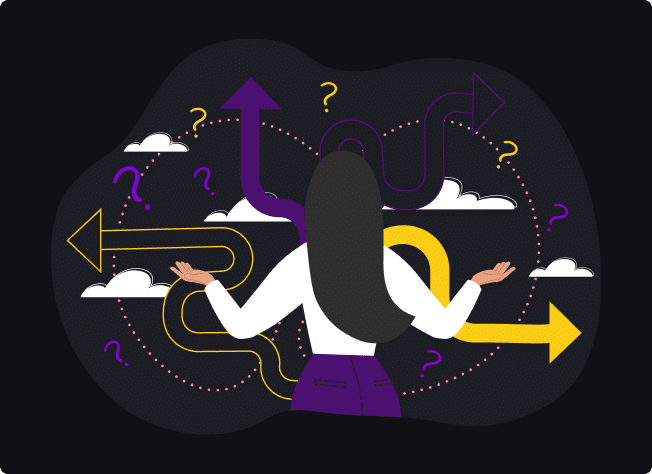
Introduction – the importance of intuitive and user-friendly navigation
At the heart of a successful online experience lies not just the content or the aesthetics but how easily and pleasantly users can find their way around. Crafting navigation that feels intuitive requires a deep understanding of the psychological underpinnings that guide human interaction with digital interfaces. This intersection of psychology and web design is where truly effective navigation systems are created.
The psychology of navigation blends cognitive science with web design principles to create efficient, engaging, and intuitive experiences.
By understanding how users think and behave and what they expect, web designers can create websites with navigation structures that align closely with the user’s natural inclinations.
From the moment visitors land on a website, their journey through its content should feel seamless, almost second nature. They should be guided by subtle cues and responsive design elements that cater to their needs and preferences.
We’ll uncover the psychological principles crucial for designing optimal website navigation – exploring key concepts of cognitive load, information architecture, and the role of memory in user experience.
By understanding these fundamental aspects of human psychology, web designers can create navigational experiences that meet users’ explicit needs and anticipate their implicit expectations.
Discover the strategies that make navigation menus a pivotal element of the user experience – enhancing satisfaction, engagement and, ultimately, the website’s success.
• • •
Understanding User Psychology
Understanding web design psychology isn’t about manipulating website visitors but crafting an experience to guide users in a way that feels so natural that they hardly notice the complexity of thought and planning behind it.
In my experience as a web designer, I’ve found that grounding design choices in web design psychology principles enhance a website’s usability and capacity to engage and satisfy users.
Key Psychological Principles
To design intuitively navigable websites, we must first dive into the minds of our users. Several psychological principles directly impact how users interact with a website:
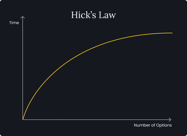
Hick’s Law: The time it takes for a person to make a decision increases with the number and complexity of choices.
In web design, a cluttered website navigation menu can overwhelm users, making it difficult to make decisions. Applying generous white space, simplifying choices, and categorising information can significantly enhance the user experience. When dealing with a large number of menu items, a mega menu (dropdown menus that use the full width of the web page) can help space and group menu items effectively to prevent people from becoming overwhelmed.
In practice, I’ve seen websites with streamlined navigation consistently outperform their more cluttered counterparts in terms of user engagement and satisfaction.
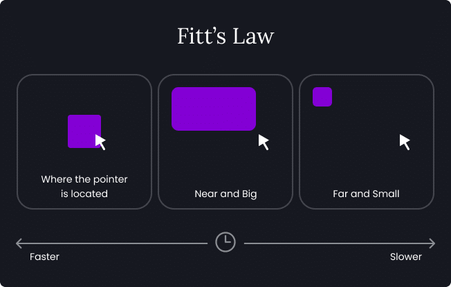
Fitts’ Law: The time required to move to a target area (like a navigation button) is a function of the distance to and size of the target.
Important website navigation elements should be large and placed in easy-to-reach areas. Reflecting on my projects, incorporating Fitts’ Law often meant reevaluating button sizes and their positioning on the page, especially for mobile users. Though sometimes subtle, adjustments markedly improved navigation efficiency and user satisfaction.
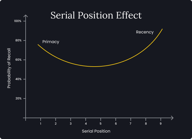
The Serial Position Effect: Users tend to remember the first and last items in a series best.
When applied to navigation design, it highlights the importance of placing critical navigation items for all the important pages at the beginning and end of menus.
Anecdotal evidence from testing various site layouts supports the effectiveness of this approach, as it significantly improves users’ ability to find key sections of a site quickly.
Designing with Psychology in Mind
Understanding these principles is just the first step. The real challenge (and reward) comes from applying them to create more intuitive, user-friendly navigation structures.
For instance, when redesigning a website that suffered from low engagement, I prioritised reorganising its navigation, taking into consideration Hick’s Law. By reducing the number of menu options and grouping services into clear categories, we not only decluttered the site but also significantly decreased users’ time searching for information. This led to a noticeable increase in engagement and a decrease in bounce rates.
Similarly, by applying Fitts’ Law, I focused on larger key action buttons and placed them in the thumb-friendly zones on mobile screens. This small change substantially impacted mobile user interactions, leading to higher conversion rates.
The psychology behind web navigation is a powerful tool in the designer’s arsenal. It offers a framework for understanding how people interact with digital spaces and making those interactions as effortless and pleasant as possible.
Experience has taught me that the most successful website navigation designs are those that are invisible to the user, guiding them seamlessly to their desired destination without confusion or frustration.
By grounding our web design strategies in psychological principles, we can create digital environments that are not only functional but truly resonant with the human experience.
• • •
Navigation Expectations and User Behaviour
Understanding how specific user behaviours and expectations influence interaction is key to effective website navigation design.
I’ve seen firsthand how cultural nuances and habitual patterns play a critical role in shaping navigation strategies that meet and exceed user requirements.
Aligning with User Expectations
Users approach websites with expectations shaped by their previous online experiences. For example, most expect the main navigation menu to be at the top of the page in some form of horizontal navigation bar or the logo in the upper left corner to link back to the homepage. Deviating from these established norms without a compelling reason or clear benefit often leads to confusion and frustration.
Aligning website navigation with user needs ensures a seamless user experience that makes sense intuitively, guiding paths users take effortlessly through the site.
In one of our projects, we were asked to remodel a navigation concept that deviated from traditional layouts and had been implemented to make a website stand out. While creative, this approach led to a significant increase in user frustration, evidenced by feedback and an uptick in bounce rates. The lesson was clear: innovation in navigation must be balanced with audience expectations for it not to become a barrier to usability.
Cultural Considerations in Navigation Design
Cultural factors can deeply influence how people interact with a website. For instance, the direction in which text is read varies across cultures—something as simple as the placement of a sidebar can align with or go against a user’s natural reading flow, impacting their experience. Having worked on websites for a global audience, I’ve learned the importance of tailoring navigation elements to match cultural expectations, such as adjusting layouts and menu structures for right-to-left languages.
Adapting to User Behaviour
Understanding and adapting to user behaviour is crucial. Analytics and heatmaps have been invaluable tools in my work, revealing how users navigate through sites in real-world scenarios. These insights allow for iterative design changes that align website navigation with actual user behaviour rather than assumptions. For example, noticing that users often scrolled past important navigation elements prompted me to redesign the layout to ensure these elements were positioned within the natural viewing area, leading to improved user engagement.
Recognising that mobile users navigate differently from desktop users has underscored the importance of adaptive navigation designs. Mobile users often rely on thumb-friendly navigation and look for quick access to information. Implementing a hamburger navigation menu on mobile versions of websites has consistently improved navigation efficiency and overall user satisfaction in my projects.
Effective website navigation design requires a nuanced understanding of user preferences and behaviour. My experiences have taught me that while creative innovation can distinguish a website, adherence to user expectations provides the foundation for an immersive user experience.
Consideration of cultural differences and leveraging analytics to understand real-world user behaviour are critical in crafting website navigation that feels natural and intuitive across diverse user bases.
The ultimate goal is to create a navigation experience that users don’t have to think about, allowing them to focus entirely on the content and actions they came for.
• • •
The Impact of Cognitive Load on Navigation Design
Understanding and managing cognitive load is crucial in website navigation design to ensure users can efficiently find information without feeling overwhelmed. In my experience, reducing cognitive load can significantly enhance user satisfaction and interaction with a website.
Defining Cognitive Load
Cognitive load is the mental processing power required to use a website. Content-rich sites that demand high concentration and effort can deter users, leading to increased exit rates and decreased satisfaction. In my work, I’ve observed that simplifying user choices directly impacts their ability to engage with content and complete desired actions, leading to visually appealing and user-friendly websites.
Strategies to Reduce Cognitive Load
Here are some effective strategies I’ve employed to minimise cognitive load through design:
- Simplify Choices: Consistent with Hick’s Law, reducing the number of choices available at any given point helps prevent decision fatigue. For a financial services website I redesigned, we reduced the number of visible options in the navigation menu from fifteen to six primary choices. This change led to a 30% increase in engagement with the site’s key sections.
- Use Familiar Layouts: Employing familiar layouts and standard web conventions assists in reducing users’ cognitive strain. In a project where we experimented with a unique, unconventional layout, user testing revealed that participants struggled more and took longer to complete tasks. Reverting to a more familiar layout improved navigation efficiency and reduced the cognitive load, as evidenced by subsequent usability tests.
- Prioritise Content with Visual Hierarchy: Effective visual hierarchy is essential for helping users navigate through information systematically, reducing the effort needed to scan the page. Implementing clear headings, subheadings, consistent typographical cues, and generous white space has improved how quickly users find information and make decisions on sites I’ve worked on.
Real-World Application and Outcomes
In a real-world application, I redesigned a content-heavy educational website where users previously complained of difficulty finding necessary information. We reduced the cognitive load by implementing a more structured hierarchy, simplifying visual elements, and grouping related content. The result dramatically reduced the number of navigation options by stripping out duplication. According to our post-launch analysis, this redesign was followed by a notable decrease in user complaints and a significant increase in page visits and time spent on the site.
The impact of cognitive load on website navigation is profound. We can create more user-friendly, successful websites by understanding and implementing strategies to reduce this load. My experience has shown that these improvements lead directly to better engagement and satisfaction, affirming the critical role of cognitive load management in effective web design.
• • •
Creating an Intuitive Website Navigation Structure
Intuitive navigation meets users’ immediate needs and anticipates their next steps, creating a seamless flow that enhances the overall user experience.
Here are key strategies we’ve implemented:
- Logical Grouping of Information: Grouping related items together in the website navigation menu helps users find information more quickly by creating a mental model of the website’s structure. For a large retail website I worked on, reorganising products into clearly defined categories led to increased user satisfaction and sales. Users could easily navigate the complexities of a broad inventory, mirroring the logical flow they experienced in physical stores.
- Consistent Navigation: Consistency in navigation across all web pages reassures users and reduces the learning curve. To make visitors feel more confident moving through a site, we always ensure that navigation bars remain consistent across different pages to reduce user confusion and increase the average duration of visits.
- Descriptive Labels: Using clear and descriptive labels for navigation links can significantly improve discoverability. Avoiding jargon and being direct with labels was crucial in a project for a technical service provider where industry-term labels had previously alienated users. Simplifying the language increased user engagement – reflected in lower bounce rates and higher click-through rates.
Implementing Intuitive Website Navigation
Implementing intuitive website navigation requires understanding the user’s journey from initial contact to the desired action. Here’s how I approached this:
- User Journey Mapping: Mapping out the user’s journey helps identify key entry points and interactions with the website. For a healthcare portal, mapping user paths highlighted the need for quick access to emergency services and regular health updates. Prioritizing these in the website navigation reduced the steps users needed to reach critical information, improving response times and user trust.
- Feedback Loops: Incorporating mechanisms for user feedback on website navigation helps refine the structure based on user preferences. Regularly updating the navigation based on user feedback ensures that it continues to meet evolving needs, as was the case with an online learning platform we revised. Continuous improvements based on feedback loops led to a steady increase in course completion rates.
• • •
Personalisation and the User Experience
Personalisation in website navigation menus can dramatically enhance the user experience by making interactions more relevant and engaging. My work in web design has shown me time and again that when website navigation is tailored to users’ individual needs and preferences, their engagement and satisfaction with a website significantly increase.
According to McKinsey, 71% of consumers expect customised experiences, and companies that get personalisation right generate +40% more revenue.
The Power of Personalisation
Personalisation means adjusting navigational elements to suit the needs of individual users better. This could be as simple as displaying different menu options based on user behaviour or as complex as dynamically changing content based on user preferences.
- Dynamic Content Display: For an e-commerce site I worked on, we implemented a dynamic navigation system that altered the displayed products and categories based on the user’s past browsing and purchasing history. This personalised approach resulted in a 40% increase in user engagement and a 25% increase in sales, as customers found locating products they were interested in easier.
- User-Specific Navigation Options: In a project for a subscription-based educational platform, we introduced website navigation options that changed based on the user’s progress and interests. New users saw introductory materials prominently while returning users were directed towards content that matched the subjects they had previously engaged with. This approach improved user retention rates by 30%.
Implementing Personalisation Strategies
Implementing personalisation in navigation involves understanding user data and making informed web design decisions that cater to it. Here’s how I approach it:
- Collecting User Data: Effective personalisation is based on robust data. Cookies and user account information can provide insights into user preferences and behaviours. For instance, while working on a members’ portal, we used browsing history to personalise the categories shown in the navigation bar, which increased users’ time spent on the site.
- Segmentation and Targeting: Dividing users into segments based on their behaviour and preferences allows for effective personalisation. For a professional networking site, we created different navigation experiences for students, job seekers, and professionals, enhancing the site’s relevance for different user groups.
- Feedback Mechanisms: Incorporating user feedback into the navigation design helps refine personalisation efforts. We’ve employed A/B testing on several projects to determine which personalised navigation elements performed best, continuously refining the approach based on user preferences and feedback.
Personalisation in website navigation is not just about enhancing aesthetic appeal or usability; it’s about creating a deeper connection with the user. Users who see content relevant to their interests and needs are more likely to engage deeply and return to a website. This valuable strategy improves user satisfaction and drives better business outcomes by making websites more effective at meeting user needs.
• • •
Testing and Refining Website Navigation
Testing and refining navigation menus based on user feedback is crucial for enhancing user experience and ensuring the web design meets its intended goals. Over my career, integrating direct user feedback has consistently proven to be one of the most effective methods to optimise website navigation and overall functionality.
The Importance of User Testing
User testing is an integral part of the navigation design process. This approach has allowed me to see firsthand how real users interact with a website, identifying strengths and areas for improvement that might not be obvious to web designers or stakeholders.
- Iterative Testing: For a recent project, we used iterative testing throughout the web design phase. Starting with wireframes, we conducted usability tests with a small group of users, gathering feedback on our initial designs. This early testing highlighted confusion around some of the terminology used in the menu, which we could adjust before moving forward with the full site development.
Effective Methods for Navigation Testing
Several user research methods can be employed to test how users perceive website navigation, each offering unique insights into how people interact with a website:
- Prototyping: Prototyping bridges initial web design concepts and full-scale development, allowing web designers and stakeholders to explore and validate interactions in a highly visual and interactive environment. Prototyping tools, such as Figma, play a crucial role in usability testing, offering a way to accurately and cost-effectively simulate website interactions before any code is written.
- A/B Testing: By presenting different versions of the navigation to different website audience segments, this type of user research allows for direct comparison of how slight variations can impact user behaviour. For instance, changing the colour and size of navigation buttons in an A/B test led to a surprising increase in click-through rates, which guided the final web design.
- Heatmaps and Analytics: Tools like Hotjar and Google Analytics provide visual data on where users click, how far they scroll, and how they move through a site. Analysing heatmap data for a client’s homepage revealed that most users were not noticing an important navigation link tucked away in the corner. Moving this link to a more prominent position significantly increased its visibility and usage.
- User Surveys and Feedback Forms: Direct feedback from users can be incredibly valuable. For several projects, we’ve implemented user research in the form of post-interaction surveys to ask them about their experience with site navigation. This feedback has been instrumental in making continuous adjustments that improve the user experience.
Refining Based on Feedback
The key to effective website navigation design is in the initial creation and ongoing refinement based on user feedback. After launching a website, we monitor user interactions and collect feedback. This ongoing collection of data helps us make incremental improvements that significantly enhance navigation clarity and user satisfaction over time.
• • •
Design Strategies that Enhance Website Navigation

Benefits of Including a Footer Menu
Incorporating a footer menu offers several psychological and practical benefits:
- Enhanced User Experience: Visitors often scroll to the bottom of a page seeking additional information. A footer menu with social media icons and navigation links ensures they can effortlessly find what they need, reducing frustration and improving overall satisfaction.
- Consistency and Structure: A well-organised footer menu provides a consistent navigation structure, helping users feel more comfortable and oriented as they navigate the site. This sense of familiarity can enhance user trust and engagement.
- Accessibility: A footer menu can serve as a secondary navigation tool, ensuring users who miss or overlook the main menu still have access to key sections of the site. This is especially helpful on longer pages where scrolling back to the top can be inconvenient.
- SEO Benefits: A footer navigation menu can improve internal linking, helping search engine bots understand the site’s structure better. This can potentially boost rankings by making it easier for search engines to index the site.
- Support for Decision-Making: When users reach the footer, they are often ready to make decisions or seek contact information. Providing navigation links at this point can guide them to important pages, such as product details, contact forms or FAQs, facilitating smoother decision-making processes.
By strategically placing navigation in the footer, websites can enhance usability, create a positive user experience, and potentially boost search engine visibility.

Optimising Mobile Navigation Structures
Mobile navigation requires specific strategies to ensure usability on smaller screens and to encourage users to engage more deeply with web pages:
- Hamburger Menus: This mobile menu type is a popular choice for mobile navigation. It maintains visual appeal by keeping the interface clean and uncluttered. Users can tap to reveal drop-down menus of options, which helps maintain a minimalist design. This encourages users to explore more of the website without feeling overwhelmed.
- Sticky Navigation Bars: Fixing the website navigation menu at the top or bottom of the screen ensures it is always accessible, reducing the need for excessive scrolling. This approach can encourage users to stay longer on web pages, as they can easily navigate to other sections.
- Thumb-Friendly Web Design: Ensuring that navigation elements are within easy reach of the thumb can significantly improve the user experience on mobile devices. Placing important buttons and links in the lower part of the screen, where they are easier to tap, can enhance usability and encourage users to interact more with the website.
- Simplified Menus: Mobile navigation should be simplified to reduce cognitive load. Using clear, concise labels and limiting the number of items in the website navigation menu can help users find what they need quickly and easily. Mega menus can be adapted for mobile use to group related items, making it easier for users to perceive the website’s structure.
- Vertical Sidebar Navigation Menu: A vertical sidebar menu can be an effective mobile navigation tool, especially for sites like news websites or an ecommerce site with extensive content. It keeps the main content area clear while providing easy access to various sections. This type of mobile menu encourages users to explore different parts of the website without overwhelming them.
- Gesture-Based Navigation: Swipe gestures can make navigation more intuitive and fluid, allowing users to move between pages or access the sidebar navigation menu with simple finger movements.
- Search Function: Including a prominent search bar within the mobile navigation structure allows users to find specific information or pages quickly. A search bar can significantly enhance the user experience by directly accessing internal links and specific content, leading to a more successful website interaction.
Implementing these strategies can help websites provide a seamless and intuitive navigation experience for mobile users. By encouraging users to interact more with web pages, these website navigation structures help create a high-performing website by improving user satisfaction and engagement.
Optimising Desktop Navigation Structures
Effective website navigation is crucial for providing a seamless user experience, especially on desktop platforms. Incorporating principles of web design psychology can significantly improve how users interact with a web page. Here are some key strategies:
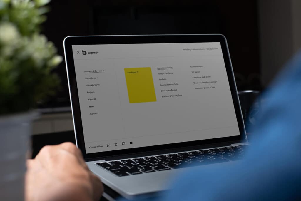
- Horizontal Navigation Bar: A horizontal navigation bar at the top of the page helps users quickly access the main menu. This layout is familiar and intuitive, aligning with user norms and making the site more user-friendly.
- Mega Menu: A mega menu can be highly effective for websites with extensive content. These dropdown menus expand to show all options at once, reducing the need for excessive clicking and helping users find what they need quickly.
- Clear Menu Items: Each menu item should be clearly labelled and easily understood. Avoid jargon and use straightforward language to guide users effortlessly.
- Use of White Space: Incorporating white space around navigation elements helps avoid clutter and makes the navigation bar more visually appealing. It ensures that other elements do not overwhelm the menu, maintaining a clean and organized look.
- Call to Action: Integrate prominent call-to-action buttons within the navigation structure. These should stand out and encourage users to take desired actions, such as signing up or making a purchase.
- Dropdown Menus: Dropdown menus can organise subcategories under main menu items, making navigating through different website sections easier without feeling overwhelmed.
By implementing these design strategies, web designers can create functional and aesthetically pleasing desktop websites. These techniques help users engage more deeply with the content, ensuring a positive and efficient browsing experience.
• • •
Closing thoughts
Effective website navigation transcends aesthetics and functionality; it encompasses understanding web design psychology principles, aligning with expectations, reducing cognitive load, creating intuitive structures, incorporating personalised elements, and continuously refining these elements based on user feedback and ethical standards.
Throughout my career, these principles have guided my approach to web design, proving that effective website navigation design is as much about the science of usability as it is about the art of user engagement.
Careful consideration of these guidelines ensures that website navigation systems not only serve their primary function—guiding users smoothly through digital content—but also enhance user satisfaction and trust.
The ultimate goal is to create website navigation that users find instinctive and responsive, which, in turn, drives better engagement and fulfils the website’s objectives efficiently and ethically.
Each project I’ve worked on has reinforced the value of a well-considered navigation strategy, highlighting its impact on the overall user experience and website success.