Table of Contents
TLDR
The article explains that responsive web design (RWD) ensures websites adapt to the user’s device, screen size, and orientation.
It emerged due to the growth of the mobile device and aims to provide a consistent and user-friendly experience across all devices.
Key components of RWD include fluid grids, flexible layouts, media queries, responsive images, and mobile-friendly navigation.
The approach benefits user engagement, increases mobile traffic, and is cost-effective. It also positively impacts SEO and involves using frameworks and tools like Bootstrap, Adobe XD, and Sketch.
Future trends in RWD focus on mobile-first design, advanced Cascading Style Sheet (CSS) grids, typography, motion and micro-interactions, adaptive images, and IoT considerations
Introduction
Now that most people access the internet through various devices such as smartphones, tablets, laptops, and desktop computers, the significance cannot be overstated. A well-designed website has the power to captivate visitors, deliver a seamless user experience, and drive meaningful interactions. However, with the increasing diversity of devices and screen sizes, designing responsive sites that look and function flawlessly across all platforms takes time and effort.
• • •
According to a recent study by W3Techs, as of March 2023, 90.4% of all websites are responsive.
• • •
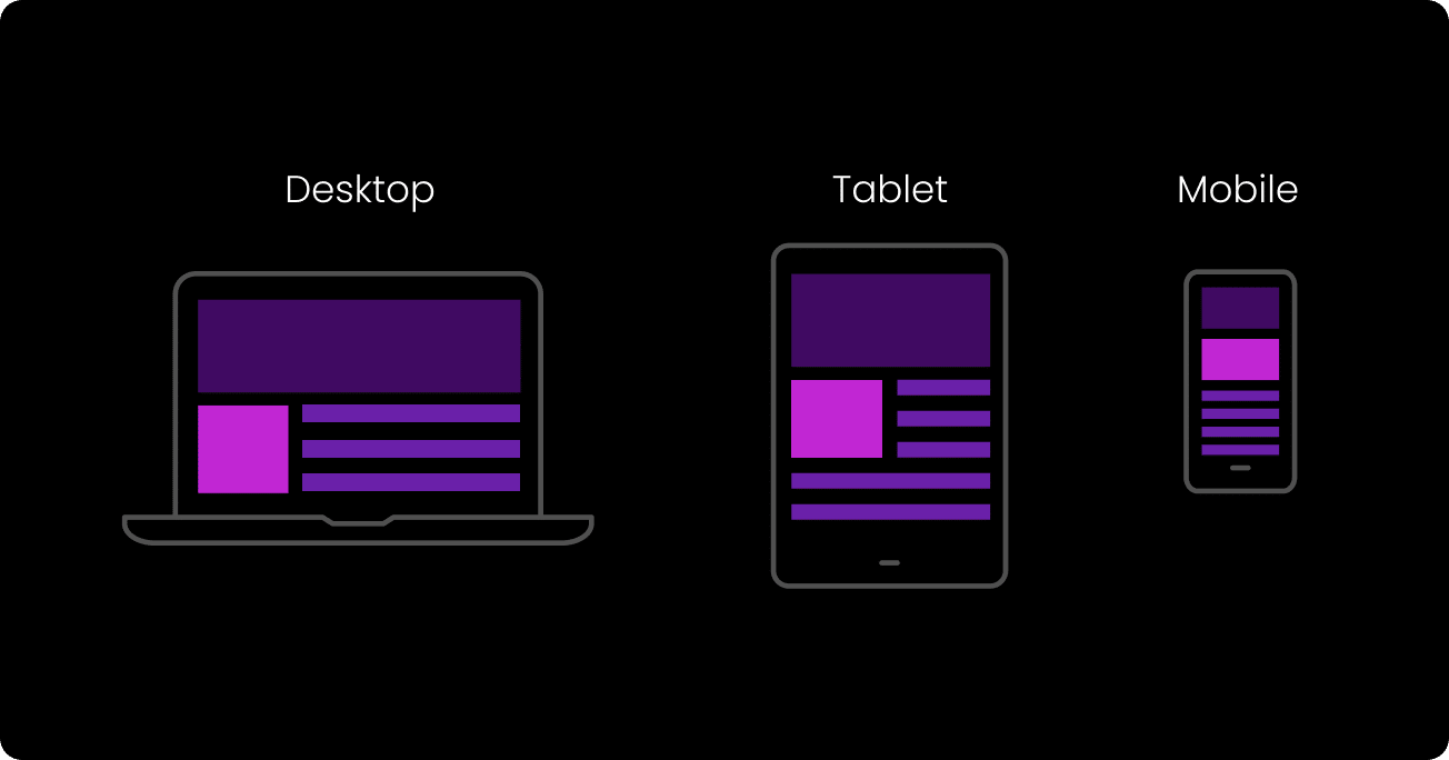
Responsiveness has transformed how websites are built and experienced. It’s a flexible design and development technique that ensures a website adapts and responds to the user’s device, screen size, and orientation. It enables web pages to seamlessly resize, reposition content and automatically adjust the overall layout to provide an optimal viewing experience in the browser window, regardless of the device used.
This comprehensive guide explores the intricacies of responsive web design and delves into its core components, benefits, best practices, and future trends. Whether you’re a web project manager or business owner, understanding RWD is essential for creating user-friendly websites that cater to the needs and expectations of today’s digital audience.

Understanding Responsive Web Design
Definition and Concept
Responsive web design is a web design and development approach that aims to create websites that automatically adapt and respond to the user’s device and screen size. It ensures that the website’s layout, content, and functionality remain consistent and user-friendly across a wide range of devices, from large desktops to small mobile screens.
Modern responsive design is rooted in recognising that the digital landscape has evolved beyond the confines of traditional desktop computers. With the proliferation of smartphones and tablets, people are accessing websites on screens of various sizes and resolutions. Responsive design addresses this challenge by providing a flexible and dynamic framework that allows websites to adjust and optimise their appearance based on the device’s characteristics.
Evolution of Responsive Web Design
The need for RWD arose with the rapid growth of mobile phones and their increasing prominence as the primary means of internet access. In the past, web design agencies developed separate mobile websites or native applications to cater specifically to users on small screens, in addition to the desktop version. However, this approach presented numerous challenges, such as maintaining consistency between different versions of the same website and the need for separate development and maintenance efforts.
Responsive design emerged as a solution to these challenges. It offers a unified approach to web design, eliminating the need for separate mobile optimized websites or applications. It was a significant shift in the web design industry.
Benefits of Responsive Web Design:
- Improved user experience and engagement
Responsive websites create a positive user experience by ensuring the content and functionality are easily accessible, readable, and usable across devices. Users no longer need to zoom in, scroll horizontally, or struggle to interact with the site, leading to increased engagement and longer browsing sessions. - Increased mobile traffic and conversions
As mobile usage continues to rise, having a responsive website is essential for capturing and retaining mobile traffic. Responsive design enables seamless navigation and an optimised layout, which can result in higher conversion rates and improved business outcomes. - Cost-effectiveness and streamlined development process
Developing and maintaining a single responsive website is more cost-effective than creating multiple versions for different devices. With responsive design, updates and changes only need to be made once, reducing development and maintenance efforts and costs.
By understanding the core components and benefits of RWD, you’ll be better equipped to create websites that adapt to the needs and expectations of today’s diverse range of devices and users. The next section delves deeper into the fundamental elements, including fluid grids, media queries, responsive images, and mobile-friendly navigation.
• • •
Core Components of Responsive Web Design
Fluid Grids and Flexible Layouts
One of the fundamental aspects of RWD is using fluid grids and flexible layouts. Instead of relying on fixed pixel-based measurements, fluid grids allow the website’s layout to adapt and adjust proportionally to different screen sizes. This ensures that the content and design elements scale smoothly, maintaining a harmonious balance regardless of the device used.
Designers can create flexible grids that dynamically resize and rearrange content by employing relative units such as percentages, ems, or rems instead of fixed pixels. Flexible layouts enable the website to fill the available screen dimensions, maximising the use of the viewport and providing a visually pleasing experience across devices.
Media Queries
Media queries are a key component of responsive web design. They allow designers and web developers to apply specific styles and layouts based on the characteristics of the user’s device, such as browser size, resolution, and orientation. With media queries, we can selectively apply different CSS styles to optimise the website’s appearance and functionality for various mobile devices, tablets and desktops.
Media queries are conditional statements targeting specific screen size ranges or device properties. Combining media queries with CSS allows designers to create responsive designs that adapt seamlessly to different devices and screen resolutions, ensuring the best possible user experience.
Responsive Images
Images play a crucial role in web design but can present challenges in a responsive context. Images not optimised for different screen sizes can slow down the website’s loading time and negatively impact the user experience. Responsive images address these issues by dynamically adapting the image size and resolution based on the device’s capabilities.
We can use various techniques to optimise responsive images. These include using the HTML code “srcset” attribute to provide multiple image sources with different resolutions, implementing CSS-based solutions like “max-width: 100%” to ensure images scale proportionally, and employing JavaScript libraries or server-side solutions that automatically generate and deliver appropriate images based on the device.
Mobile-Friendly Navigation
Navigation is a critical aspect of all websites, requiring special attention in responsive design. Traditional navigation menus designed for desktop devices may translate poorly to smaller mobile screen real estate with limited space. Mobile-friendly navigation involves rethinking the menu structure and implementing intuitive and accessible navigation patterns for mobile users.
Common approaches to mobile-friendly navigation include collapsible menus, hiding content in off-canvas menus, and hamburger menus. These techniques allow us to hide or reveal navigation as needed, conserving screen space while providing easy site navigation access. The goal is to ensure users can navigate the website effortlessly on any device, enhancing the overall user experience.
Understanding and implementing these core components of RWD allows you to create websites that adapt seamlessly to different devices, screen size, and user preferences.
• • •
Best Practices for Responsive Design
Designing for Mobile Devices
A mobile-first approach is a design philosophy that prioritises the development of a website’s mobile version before expanding it to larger computer screen sizes. With most internet users accessing websites through mobile phones, designing for mobile-first ensures that the user experience is optimised for smaller screens and touch interactions.
With mobile design, you can focus on meaningful content and features, streamline the user interface, and ensure fast-loading web pages. As the screen size increases, you can progressively enhance the design and add more features to accommodate larger devices. This approach helps create a cohesive and efficient user experience across all devices.

Designing for Desktop Devices
Desktop screen resolutions continue to increase, offering more screen width and allowing users to resize their browser windows instead of keeping them full-screen. This behaviour highlights the need for web pages to adapt dynamically as the screen size decreases. By using media queries, developers can create a responsive page that adjusts to different browser widths and viewport widths. Media query breakpoints enable the web page to switch from a multiple column layout to a single column layout, ensuring optimal readability and usability regardless of the device width.
Flexible images and CSS techniques like setting min width and maximum width properties are essential for maintaining the integrity of a web page’s design as it adapts to various screen sizes. These techniques, combined with media queries, ensure that content is displayed appropriately, accommodating both large desktop screens and smaller mobile screens. Device rendering is optimised by carefully considering device width and viewport width, allowing for seamless transitions and a consistent user experience across different devices.
Performance Optimisation
Website performance is crucial for responsive design. Users expect fast-loading pages, especially on mobile phones with potentially limited bandwidth. Optimising website performance involves minimising file sizes, leveraging caching mechanisms, and reducing the number of server requests. You can test your web page speed here if you suspect your site isn’t performing.

Techniques like minifying and compressing CSS and JavaScript files, optimising image sizes, and utilising browser caching can significantly improve load times. Additionally, employing responsive design principles such as lazy loading images (loading images only when they come into view) can enhance performance and minimise data usage.
Testing and Debugging
Testing and debugging are essential steps in the design process to ensure the website functions as intended across various devices and screen sizes. Testing the website on multiple devices, including smartphones, tablets, laptops, and desktops, is essential to identify layout or functionality issues.
Responsive design testing tools, such as browser extensions or online services, can assist in previewing how the website layout elements appear on different devices. Additionally, browser developer tools to inspect and debug the website’s layout and CSS can help identify and fix any responsive design issues.
Regular testing and debugging throughout the development process and post-launch can ensure a smooth and consistent user experience across all devices.
By adopting a mobile-first approach, optimising performance, and conducting thorough testing and debugging, you can create responsive websites that deliver exceptional user experiences.

The Responsive Web and SEO
Responsive web design significantly impacts search engine optimisation (SEO) and can dramatically influence a website’s visibility and ranking on search engine results pages (SERPs). With the advent of mobile-first indexing by search engines like Google, the mobile-friendliness and responsiveness of a website are crucial ranking factors. Here’s how RWD and SEO are interconnected:
- Mobile-First Indexing
In response to the growing dominance of mobile devices, search engines now prioritise mobile-friendly websites over desktop-only versions. With mobile-first indexing, search engines predominantly use the mobile version of a website’s content to determine its relevance and ranking in search results. By having a responsive design, you ensure that your website is optimised for mobile devices and stands a better chance of ranking higher on SERPs. - Improved User Experience
Responsive web design directly impacts user experience, an essential aspect of SEO. A responsive website provides a seamless and consistent user experience across different devices, reducing bounce rates and increasing engagement. When users have a positive experience on your website, they are more likely to spend more time on it, interact with its content, and potentially convert, signalling to search engines that your website is valuable and deserving of higher rankings. - Reduced Duplicate Content
Without responsive design, website owners often create separate site versions for mobile and desktop users. This can lead to issues with duplicate content, as search engines may view these versions as two separate websites with identical or similar content. With responsive design, you have a single website with the same content that adjusts to different devices, eliminating the risk of duplicate content penalties. - Mobile Usability
Search engines prioritise websites that offer an excellent mobile user experience. Responsive web design ensures your website is mobile-friendly, with optimised fonts, buttons, and navigation that are easy to use on touchscreens. By meeting the mobile usability criteria, search engines are more likely to rank your website higher in mobile search results.
To optimise your responsive website for SEO, employ the following strategies:
- Conduct keyword research and incorporate relevant keywords into your content and metadata.
- Optimise your website’s loading speed by compressing images, minimising code, and utilising caching techniques.
- Ensure proper indexing of your website’s mobile and desktop versions through XML sitemaps and responsive design implementation.
- Implement structured data markup to enhance search engine understanding of your website’s content.
- Optimise title tags, headings, and meta descriptions for better visibility on SERPs.
- Regularly monitor and analyse your website’s performance, user behaviour, and search engine rankings to identify areas for improvement.
Combining RWD with effective SEO strategies will enhance your website’s visibility, attract organic traffic, and provide an optimal user experience across all devices.
• • •
Responsive Design Frameworks and Tools
Introduction to Frameworks:
Responsive frameworks are pre-built sets of CSS, JavaScript, and HTML components that provide a foundation for creating responsive websites. These frameworks offer reusable code and design patterns, allowing developers to expedite the development process and ensure consistent responsiveness across devices.
Overview of Popular Responsive Design Frameworks
There are several widely used RWD frameworks available, such as Bootstrap, Foundation, and Bulma. These frameworks provide a range of features, including grid systems, typography, pre-styled UI components, and responsive navigation menus. They often follow best practices and offer responsive design solutions out of the box, saving developers time and effort.
Pros and Cons of Using Frameworks
Responsive design frameworks offer several benefits, including faster development speed, a well-tested and reliable codebase, and a consistent design language. Frameworks often come with extensive documentation, community support, and active development, making troubleshooting issues easier and staying up-to-date with responsive design practices.
It’s important to consider the potential drawbacks as well. Frameworks may come with a learning curve, as developers must familiarise themselves with the framework’s structure and conventions. Using a framework can also result in websites that look similar to others built using the same framework, potentially sacrificing uniqueness in design.
Responsive Design Tools
Essential Tools for Designing and Testing Responsive Websites
Various tools are available to assist in designing and testing responsive websites. Tools like Adobe XD, Sketch, and Figma provide designers with a platform to create responsive design mockups, wireframes, and prototypes. These tools offer features like artboards, responsive resizing, and preview options, enabling designers to visualise and iterate on responsive designs efficiently.
For testing and debugging, browser developer tools, such as those in Google Chrome or Firefox, are invaluable. They allow developers to inspect and modify the layout, styles, and breakpoints of a responsive website in real time, making it easier to identify and fix responsive design issues.
Helpful resources & software
Besides frameworks and design tools, numerous online resources and software are available to aid in responsive design. Responsive design testing websites, such as BrowserStack and LambdaTest, allow developers to preview their websites on different devices and screen sizes without physically owning all of them. CSS preprocessors like Sass and LESS can streamline CSS development by providing advanced features such as variables, mixins, and functions.
There are online communities, forums, and tutorials where developers and designers can learn and share insights on responsive design best practices. These resources can also help you stay updated with the latest trends, techniques, and tools in responsive design.
By leveraging responsive design frameworks and utilising helpful tools and resources, you can expedite the development process, maintain consistency, and create websites efficiently.

Future Trends in Responsive Web Design
Responsive design continues to evolve as new technologies and user expectations emerge. Staying ahead of these trends is crucial for web designers and developers to create cutting-edge websites that deliver exceptional user experiences. Here are some future trends and emerging technologies to keep an eye on:
1. Mobile Design and Progressive Enhancement
As mobile usage continues to dominate, mobile design principles will remain essential. Designers will focus on creating streamlined and optimised experiences for mobile browsers, ensuring fast-loading pages, intuitive navigation, and gesture-based interactions. Progressive enhancement, which involves starting with a core experience for all devices and progressively enhancing it for more advanced capabilities, will gain traction to provide tailored experiences for each user.
2. Advanced CSS Grid Layouts
CSS Grid, a powerful layout system, will become more prevalent in responsive design. It allows for complex and flexible grid structures, enabling designers to create sophisticated and visually appealing layouts. With CSS Grid, designers can easily create responsive grid structures with multiple columns that accommodate different screen sizes and orientations.
3. Responsive Typography
Typography that adjusts font sizes, line spacing, and text readability based on screen size, will continue to be a focus. Variable fonts, a technology that allows for dynamic variations in font-weight, width, and other characteristics, will gain popularity. This enables designers to craft more personalised and responsive typographic experiences for users.
4. Motion and Microinteractions
The use of motion and micro-interactions will continue to enrich the user experience in responsive design. Thoughtful animations, transitions, and micro-interactions can guide users, provide feedback, and enhance engagement. However, it’s important to use motion sparingly and purposefully, considering its impact on performance and accessibility.
5. Adaptive Images and Responsive Media
With the increasing demand for rich media content, optimising images and media for responsive design will remain important. Techniques like the <picture> element and the <srcset> attribute will continue to be utilised to deliver the most appropriate image or media based on the user’s device capabilities, screen size, and network conditions.

6. Internet of Things (IoT) and Responsive Design
As IoT devices become more prevalent, responsive design will extend beyond traditional screens. As web designers, we must consider responsiveness for smart home devices, wearables, and other IoT interfaces. Creating adaptive and intuitive experiences for these devices will ensure seamless integration into users’ lives.
We can create forward-thinking and highly adaptable websites by embracing these future trends and staying abreast of emerging technologies.
Responsive design has become a fundamental approach in the web development landscape, enabling websites to adapt and provide optimal experiences across a multitude of devices. Understanding the core components, best practices, and future trends of responsive web design empowers our designers and developers to create user-friendly, visually appealing, and future-proof websites.
As technology advances and user expectations evolve, responsive design will continue to grow alongside it. By embracing mobile design, leveraging frameworks and tools, optimising performance and SEO, and staying ahead of emerging trends, we can create responsive sites that thrive in the dynamic digital landscape.
Through responsive design and keeping the user at the centre of our design decisions, we can craft exceptional experiences that seamlessly adapt to the ever-changing digital world.
The Power of Responsive Design
Responsive design has revolutionised how we approach website development, enabling us to create adaptive and user-centric experiences across devices. By embracing responsive design principles, our web designers and developers can overcome the challenges posed by the diversity of screen sizes, resolutions, and user contexts.
Throughout this article, we have explored the concept of responsive web design, its core components, best practices, and future trends. We’ve seen how fluid grids, CSS media queries, images, and mobile-friendly navigation provide a seamless user experience. We’ve also discussed the importance of adopting a mobile-first approach, optimising performance and conducting thorough testing and debugging.
Furthermore, we’ve highlighted the interconnectedness between responsive web design and SEO, emphasising the need to create mobile-friendly websites that provide excellent user experiences to improve search engine rankings.
We’ve delved into the principles of responsive web design frameworks and tools, which expedite the development process and ensure consistency and efficiency. By leveraging these resources, designers and developers can create websites more effectively, saving time and effort.
Finally, we’ve explored the future trends and emerging technologies shaping responsive web design, such as mobile-first design, advanced CSS grids, typography, motion and micro-interactions, adaptive images, and the expanding influence of IoT.
As the web continues to evolve, responsive design remains a critical aspect of website development. By prioritising the user experience, embracing innovative technologies, and staying up to date with industry trends, we can create websites that seamlessly adapt to the needs and expectations of users across devices.
Responsive web design is not a trend—it’s a necessity. By embracing its principles and harnessing its power, we can create websites that are accessible, engaging, and future-proof. We look forward to continuing to push the boundaries of RWD and shaping tomorrow’s digital experiences.