
Table of Contents
TLDR
Though design trends come and go, underlying design principles remain a constant. This guide delves into visual hierarchy in web design, detailing how to apply its core principles to enhance user experience. It includes actionable strategies, examples for clarity, essential tools for testing and refinement, and highlights common mistakes to sidestep.
Aimed at improving engagement and functionality, it’s a comprehensive resource for designers looking to elevate their web projects.
Introduction
Visual hierarchy in web design is essential for structuring content so it aligns with how we naturally process visual information. It uses elements like size, colour, contrast, and placement to guide viewer attention, making websites intuitive to navigate. The arrangement of these elements on a webpage significantly influences user interaction, directing attention to key information and actions.
This article delves into visual hierarchy principles, offering insights on enhancing web design to improve user experience. By applying these principles, designers and developers can ensure important website elements are prominently displayed, facilitating better engagement and interaction.
Whether you’re refining your design approach or learning the basics, understanding visual hierarchy is crucial for creating effective web pages. Let’s explore how to leverage design and psychology to make your website stand out.
• • •
Understanding Visual Hierarchy
Visual hierarchy is a fundamental principle in web design that organises content in a way that matches our natural visual processing. It is about arranging elements so that the most important ones catch the viewer’s eye first. This section breaks down the concept and its components, making it easier for you to apply these principles to your designs.
What is Visual Hierarchy?
At its simplest, visual hierarchy involves the arrangement of visual elements in a design in order of importance. It dictates the order in which the human eye perceives what it sees. This is not just about what looks good; it’s about creating a path for the viewer’s eye to follow, ensuring they see what you want them to see, in the order you want.
Components of Visual Hierarchy
Visual hierarchy relies on several key components to guide the viewer’s attention effectively:
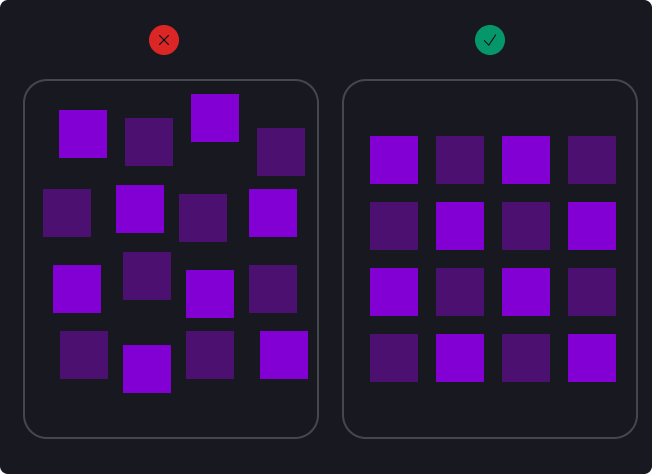
- Size and Scale: Larger elements have more visual weight and are more likely to be seen first. Using size strategically can direct attention to key information or actions you want the user to take.
- Colour and Contrast: Bright colours and high contrast between elements can grab attention more effectively than muted colours and low contrast. Colour can also convey mood, brand identity, and signal action.
- Typography: The choice of fonts, their size, spacing, and colour can significantly impact how text is received and understood. Different typefaces can convey different feelings and importance.
- Spacing and Alignment: The arrangement of elements in relation to each other and the space around them (including whitespace) can help to create order and group related items.
- Imagery: Images, icons, and graphics can quickly communicate ideas and emotions, drawing attention and providing visual cues to content.
Why is Visual Hierarchy Important?
The goal of a good visual hierarchy is not just to make a page aesthetically pleasing but to enhance usability and improve user experience. By guiding the viewer’s eye through a website in a logical flow, you can help them find information faster, understand content more easily, and take desired actions without confusion.
In web design, where users often scan pages quickly rather than read every word, applying visual hierarchy can make the difference between a site that communicates effectively and one that loses users due to frustration or confusion. Whether you’re designing a landing page, an e-commerce site, or a blog, understanding and applying visual hierarchy principles is key to creating engaging and effective web experiences.
• • •
Advanced Applications of Visual Hierarchy Principles
Understanding and applying visual hierarchy principles with depth can transform the user experience on a website. Let’s delve into each principle with enhanced explanations and multiple examples to illustrate their impact.
Size and Scale
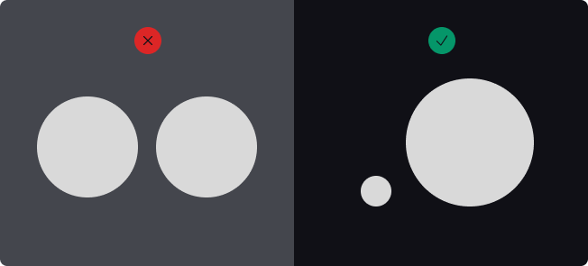
Advanced Application: The strategic use of size not only captures attention but also implies the importance and hierarchy of information. Larger elements dominate the visual field, making them ideal for key messages or actions you want users to engage with first. Scale variation can guide the viewer through a content journey, subtly emphasising the narrative or marketing flow.
Examples:
- Hero Images: A full-screen hero image with a captivating visual narrative sets the scene for the entire website, immediately engaging users.
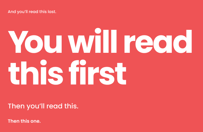
- Headline Hierarchy: A headline in an oversized font draws focus first, followed by progressively smaller subheadings and body text, creating a clear, logical flow of information.
Colour and Contrast
Advanced Application: Colour not only attracts the eye but also triggers emotional responses and conveys brand identity. High contrast ensures legibility and focus, which is especially important for key information and calls to action. Using complementary colours or contrasting shades can make an important visual element pop, directing user focus where it’s most needed.
Visual hierarchy examples:

CTA Buttons: An ‘Add to Cart’ button in a vivid colour against a subdued background not only stands out but also invites action through its visual appeal.
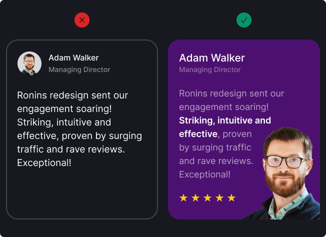
Information Highlighting: Using a contrasting background for essential elements, such as a testimonial section or a blockquote, can draw attention to customer feedback or important statements, making them more memorable.
Typography
Advanced Application: Typography is not just about choosing fonts; it’s about creating a visual order and enhancing readability. Through the use of varied weights (bold, regular, light), styles (italic, uppercase), and font size, typography can create a visual map for the user, indicating what to read first and what is supplementary.
Visual hierarchy examples:
Navigational Clarity: Differentiating navigational elements with uppercase letters or a distinct font weight can create emphasis, make them stand out and improve site navigation.

Content Engagement: Employing a distinctive, stylised font for pull quotes within long-form content can break monotony, adding visual interest and encouraging continued reading.
Layout and Composition
Advanced Application: A thoughtful layout considers not just the placement of elements but also their relationship to each other. Using grids for alignment and spacing can create visual structure – a rhythm and visual flow that makes content more digestible. Proximity groups related items, while whitespace can highlight or separate information, improving clarity and focus.
Visual hierarchy examples:
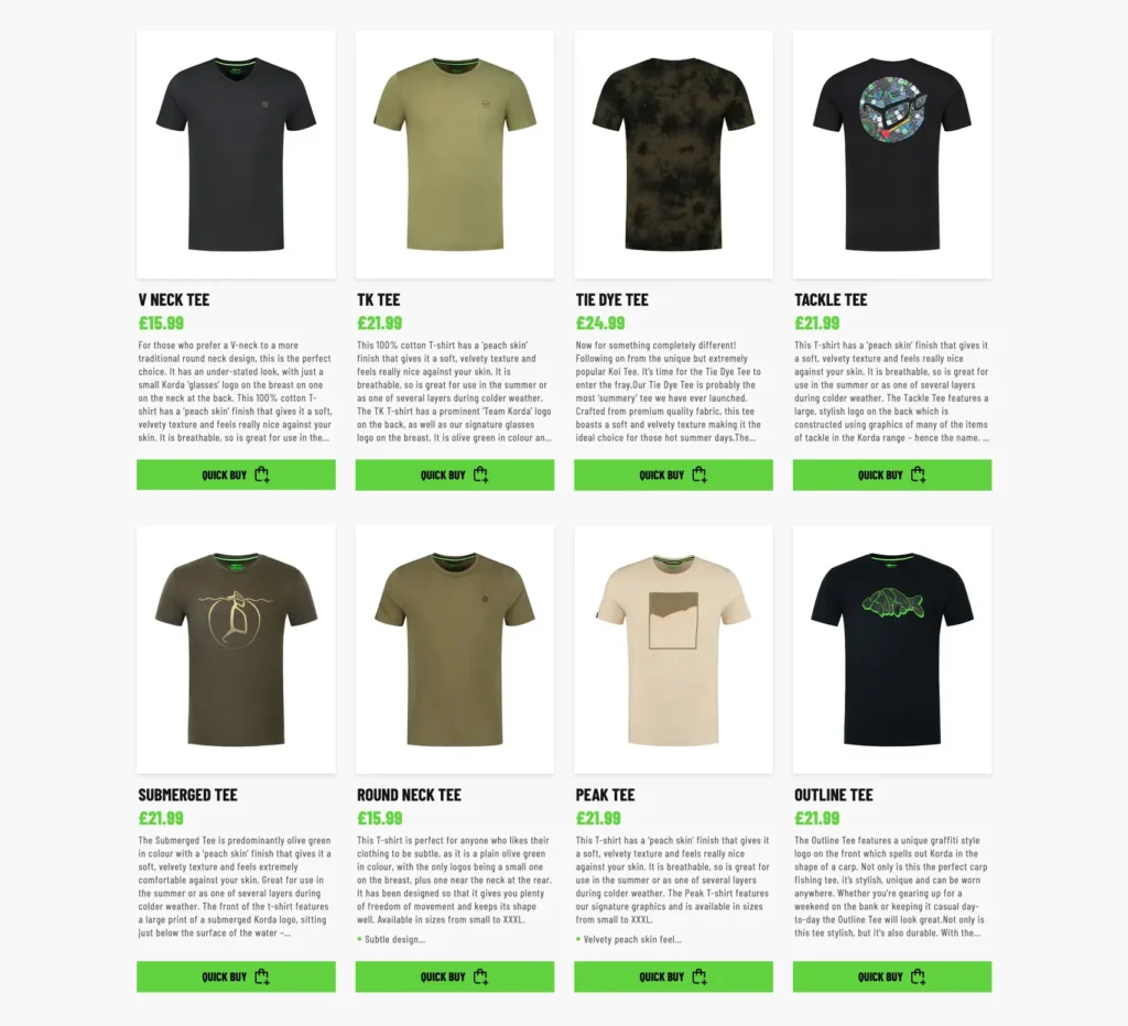
Product Catalogues: Employing a consistent grid layout for products creates a visual flow that allows users to easily compare items, enhancing the shopping experience.
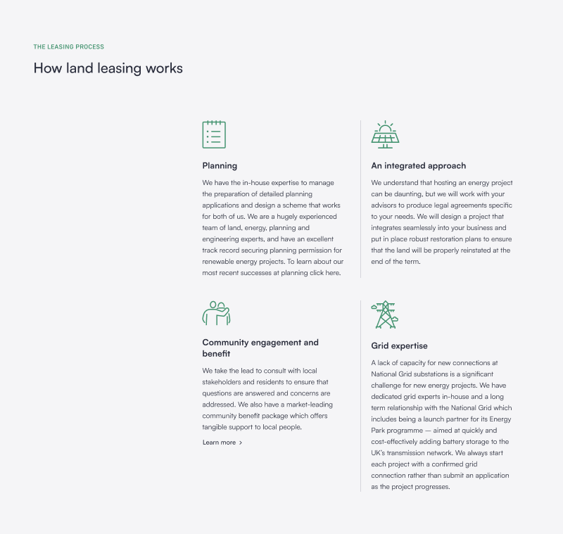
Feature Lists: Aligning icons with short text descriptions creates clean lines for the eye to follow, making features easily comprehensible at a glance.
Imagery and Icons
Advanced Application: Beyond mere decoration, imagery and icons are graphic elements that serve as visual shorthand, conveying complex ideas quickly and efficiently while commanding visual attention. Selecting relevant, high-quality images can tell a story or illustrate a point more powerfully than words alone. Icons should be intuitive, aiding in navigation and comprehension without overwhelming the user.
Visual hierarchy examples:

Storytelling through Imagery: Using images that reflect real-life applications of products or services can create a narrative, connecting emotionally with the viewer.
Consistent Iconography: Using icons designed uniformly for features or services across the site enhances brand cohesion and user familiarity.
Mastering Visual Hierarchy in Web Design
Implementing visual hierarchy with depth involves a nuanced understanding of how users interact with visual elements. By prioritising content effectively, creating focus points, and continuously testing and refining your design based on user feedback and analytics, you can craft experiences that not only attract users attention but also convert. Advanced application of visual hierarchy principles elevates the design from functional to exceptional, ensuring users stay longer on your site and engage more deeply with your content.
• • •
Implementing Visual Hierarchy in Web Design
Implementing visual hierarchy effectively requires a strategic approach, focusing on how design elements can be optimised to guide user behaviour and improve the overall user experience. Here’s how you can apply visual hierarchy principles to enhance web design:
Prioritise Content
- Key Action Identification: Identify the primary action you want users to take on each page. This could be making a purchase, signing up for a newsletter, or accessing more information. Use size and positioning to make these actions immediately visible and accessible.
- Content Structuring: Organise content based on its importance. Use headers to introduce sections and subheaders to break down information further. This helps create a logical flow and aids in scanning, allowing users to find the information they seek quickly.
Create Focus Points
- Contrast for Emphasis: Employ contrast effectively to create focal points on your page. This can be achieved through colour contrasts between background and text, or between different design elements to draw attention to calls to action.
- Whitespace for Clarity: Use whitespace around important information or buttons to reduce clutter. This not only makes your site more aesthetically pleasing but also helps in directing attention to key elements by isolating them from surrounding content.
Guide the User’s Journey
- Navigational Cues: Use directional cues such as arrows or lines, or even the gaze of people in images to subtly guide users towards specific elements. This can be particularly effective in leading users to less prominent but important content.
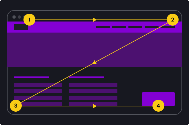
- Layering Information: Implement a Z-pattern or F-pattern layout in your design, aligning with Western cultures’ natural reading patterns. Place the most crucial information and calls to action along these paths to ensure they capture user attention over other elements.
Test and Iterate
- User Feedback: Regularly gather user feedback through surveys, user testing sessions, and usability tests. Understanding how real users interact with your design can provide invaluable insights into improvements.
- Analytics and Heatmaps: Tools like Google Analytics and heat mapping software such as Microsoft Clarity can show where users click, how far they’re scrolling, and what they’re ignoring. Use this data to refine your visual hierarchy, ensuring it aligns with user behaviour and preferences.
Visual hierarchy is a dynamic and essential component of effective web design, directly influencing user engagement and the success of your website. By prioritising content, creating clear focus points, guiding the user journey, and continuously testing and refining your approach, you can create websites that look good and perform well. Remember, the goal is to make the user’s interaction as simple and efficient as possible, leading to a positive experience and achieving the desired outcomes of your site.
• • •
Tools and Techniques for Testing Visual Hierarchy
Once you’ve learnt how to create visual hierarchy in your web designs, assessing its effectiveness is crucial. Testing and analysis provide insights into user behaviour, helping refine and optimise the design. Here are tools and techniques to evaluate visual hierarchy:
Analytics Tools
- Google Analytics: Use this tool to understand user behaviour, including which pages are most visited, how long users stay, and what paths they take through your site. High bounce rates on important pages may indicate issues with visual hierarchy.
- Heat Mapping Tools: Software like Hotjar or Crazy Egg offers heat maps, scroll maps, and click maps. These visual tools show where users are looking, clicking, and scrolling on your site, highlighting which elements attract attention and which are overlooked.
User Testing
- Remote User Testing: Platforms like UserTesting allow you to get feedback from real users who navigate your site. Watching how they interact with your design can offer direct insights into the effectiveness of your visual hierarchy.
- A/B Testing: Tools like Optimizely or Google Optimize let you present two versions of a page to different segments of your audience to see which performs better. This is particularly useful for testing different layouts, colour schemes, or element sizes to see what best directs user attention.
Expert Reviews
- Design Consultations: Sometimes, getting a professional designer to review your site can provide new perspectives on your visual hierarchy. They can offer advice on best practices and potential improvements.
- Accessibility Checks: Tools like the WAVE Web Accessibility Evaluation Tool help ensure your site’s visual hierarchy is accessible to users with disabilities, including those using screen readers, ensuring you’re not inadvertently excluding a portion of your audience.
Continuous Improvement
Testing and refining your visual hierarchy is an ongoing process. User preferences and web design trends evolve, so what works today might need adjustment tomorrow. Regularly using these tools and techniques ensures your website remains effective, engaging, and accessible to all users. Remember, the ultimate goal is to create a seamless and enjoyable user experience that guides visitors naturally through your content, encouraging them to take the actions you desire.
• • •
Common Pitfalls to Avoid in Visual Hierarchy
Creating an effective visual hierarchy requires more than just understanding and applying the principles; it also means being aware of and avoiding common mistakes that can undermine your efforts. Here are some pitfalls to watch out for:
Overloading Information
- Problem: Cramming too much information into a small space can overwhelm users, making it hard for them to identify the key points or actions.
- Solution: Prioritise content based on your objectives and user needs. Use whitespace effectively to give each element room to breathe, making the design cleaner and more digestible.
Lack of Consistency
- Problem: Inconsistent use of colours, fonts, and element sizes can confuse users, making your site feel disjointed and harder to navigate.
- Solution: Establish a design system or set of guidelines that dictate the use of visual elements across your site. This ensures consistency, which aids recognition and navigation.
Ignoring Mobile Responsiveness
- Problem: Failing to design for mobile can lead to a poor user experience, with elements that are too small to interact with or content that’s difficult to read.
- Solution: Design responsively, ensuring your visual hierarchy adapts effectively across different screen sizes. This often means simplifying layouts or altering element sizes and spacing for smaller screens.
Neglecting Accessibility
- Problem: Overlooking accessibility can exclude a significant portion of your audience, especially those with visual impairments.
- Solution: Use colour contrasts that meet accessibility standards, ensure text is resizable, and provide alt text for images. This not only broadens your audience but also improves overall usability.
Underestimating the Importance of Testing
- Problem: Assuming your design is effective without gathering user feedback or analysing behaviour can lead to missed opportunities for improvement.
- Solution: Regularly test your design with real users and use analytics to understand how they interact with your site. Be open to making changes based on this feedback.
Avoiding these common pitfalls in visual hierarchy can significantly enhance the effectiveness of your web design. By focusing on clarity, consistency, responsiveness, and accessibility, you can create a user-friendly website that effectively guides visitors to the desired actions. Remember, clear visual hierarchy is not just about making a site look attractive; it’s about creating a seamless and intuitive user experience that aligns with both user needs and business goals.
• • •
Wrapping up
First impressions are pivotal, so mastering the art of good visual hierarchy is essential for crafting web designs that captivate and communicate effectively. This exploration into the principles of visual hierarchy, alongside practical applications and common pitfalls, underscores the significance of thoughtful design in enhancing user experience.
By prioritising content, creating focal points, guiding the user journey, and leveraging tools for testing and refinement, designers can ensure their websites are visually appealing and highly functional. The key lies in understanding how users interact with visual elements and using this knowledge to create intuitive and engaging digital environments.
It’s crucial to remember that clear visual hierarchy is not a one-size-fits-all solution. It requires continuous learning, experimentation, and adaptation to user feedback and evolving design trends. The digital world is dynamic, and so should be our approach to design.
Whether you’re a seasoned designer or new to design projects, the journey towards creating more effective and engaging websites is ongoing. By avoiding common pitfalls and staying committed to testing and improvement, we can create digital experiences that resonate with users and stand the test of time.
The need to innovate, inspire, and influence through the power of visual design is more critical now than ever, and when it comes to creating hierarchy, every detail is an opportunity to connect, engage, and leave a lasting impression.