
CUSTOM WEB DESIGN
Most businesses that come to us about responsive web design are dealing with the same thing. Their website was built a number of years ago and it was good enough at the time but the content has grown and the layout has stretched and now the mobile experience is quietly costing them leads they never see.
Google only crawls the mobile version of your site now and their manual reviewers check it on a phone too, so if the responsive design is not right you are not just losing visitors you are losing visibility.
We are a responsive web design agency based in London and Surrey and we work with founders, product leaders and marketing teams all over the UK and globally who have reached the point where the site on their phone does not match the business they are running. Sometimes that means rebuilding the front end, sometimes it means rethinking the content and the user journeys nd sometimes the whole thing needs to start again.
WHAT WE DO TO DIGITAL EXPERIENCES
What success looks like
A responsive website that just works. Pages and content that fit every screen without anyone thinking about it, a site that converts at every breakpoint and loads before your visitor has time to reconsider. If your team has started noticing things and tinkering with layouts because something looks off on certain devices then that is exactly the problem we solve.
Problems we solve
The responsive issues we see tend to follow the same patterns. Content that was written for a desktop creates walls of text on a phone. Buttons that float off screen or sit too close together for a thumb to hit cleanly. Images that were never optimised for mobile take so long to load that your users leave before the page has finished rendering.
We optimise
We track conversions, page speed, content engagement and search engine rankings on our own site and we do the same for our clients. Responsive web design is not something you build once and walk away from. Screen sizes change, browsers update and user behaviour shifts. Neglect the small adjustments on a regular basis and you end up needing a revolution instead of an evolution.
Select works from Our Design Studio
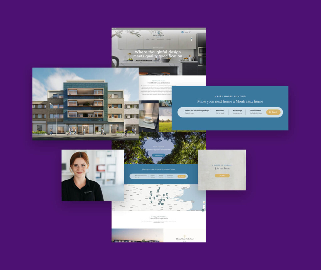
MONTREAUX HOMES
Creating a digital experience that feels like walking through one of their homes.
MORGAN CONTRACTORS
A bold new identity with confidence

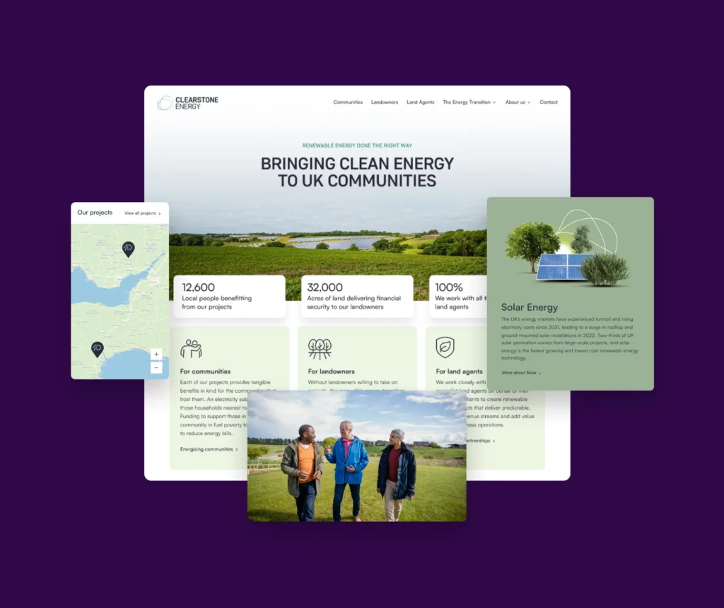
CLEARSTONE ENERGY
Putting people at the heart of the UK’s low-carbon future.
Our Digital Agency Technologies
WordPress
Still the most flexible platform out there, we like it because it scales, it’s secure when built properly and your team can update content without fear of breaking the site.
WordPress
Webflow
Webflow’s great when design is the most important, it gives you full control of the layouts and motions, No plugins and a responsive site that looks exactly how it was designed.
Webflow
Bespoke
Sometimes going off-the-shelf no longer words for your business model and your complex workflows, dashboards and integration need something built just for you.
Bespoke
Sitefinity
Is great for enterprise projects, It handless scale, multiple teams and tight governance structure. We use it when content needs approvals and translations without slowing editors down.
Sitefinity
Shopify
Shopify is the king of eCommerce platforms, Checkout, payments, orders and stock management al come out of the box leaving you to just add your own brand.
Shopify
WooCommerce
If you’re already on WordPress and need e-commerce then wooommerce is the smartest move. It’s flexible, scalable, and you stay in control in the interface you already know.
WooCommerceRESPONSIVE DESIGN FOR MOBILE DEVICES
What we build
Marketing websites: We design and build responsive websites that ensure your brand stands out, stays visible in search with a structure that Google understands.
E-commerce platforms (Shopify and WooCommerce): We create storefronts that are designed to inspire and increase conversion with product pages that are informative and intuitive.
Multilingual and multi-region sites: We build multi lingual websites that keep your brand consistent while optimising for each market, the right language, the fight currency and the right search intent.
Custom web apps and workflows: We build custom apps that take your brand experience into web apps, mobile apps, ai experiences and portals.
Headless or hybrid builds: We deliver a headless architecture that delivers instant load times and strong Core Web Vitals scores while the search visibility stays solid no matter what content you throw at it or how many devices your users are coming from.

OUR DESIGN PROCESS FOR DIFFERENT SCREEN SIZES
How we deliver it
We start strategy: Before we do anything we as questions, lots of questions and look at how users are using your site, where they drop off, what they skip, what is slow and what is broken on which devices.
We design for the smallest screen first: Everything starts on mobile because that is where most of your users are and that is what Google is judging you on. If the experience works on a phone it will work everywhere else.
We build so your team can run it: A responsive website that only we can update is not a responsive website it is a dependency.
We test on real devices not just browser windows: Resizing a browser is not the same as using a phone on a train with one hand and a bad connection.
We stay close after launch: Launch day is when we get to see how users actually behave, where they get stuck, what content earns attention and what gets skipped.

FAQs
Questions we are asked before we are hired
Why is responsive design important?
This is simple, most of your customers are on mobile phones and Google only crawls the mobile site now so if your responsive website design is not working you are invisible to both. It is not just about things looking tidy on a smaller screen, it is about load speeds, site structure and making sure the interactive elements actually work under a thumb. We rigorously test across different devices because this is what your customers will see.
Do we need a new site or can you fix ours
This really depends on what is under the hood, sometimes the front end development just needs reworking so the web pages adapt properly and the responsive images scale without killing load speeds. Other times the site was never built with mobile users in mind and patching it costs more than starting again. We always audit first and give you an honest answer with more detail on what is actually broken before we recommend a new website.
How long does a responsive build take?
There are usually a number of factors that drive this but generally this depends on the scope of the project, but a typical responsive web design project takes eight to twelve weeks if the website content is ready and the business goals are clear. Bigger builds with ecommerce or multilingual requirements take longer on mobile phones and we will tell you that upfront.
What makes a site mobile friendly?
It is more than just shrinking the desktop layout down. Mobile friendly websites use media queries and min width breakpoints in the CSS to control how the layout behaves at every screen size rather than hoping it scales. That means responsive images that do not bloat the page, tap targets that are big enough for a thumb and user friendly navigation that does not hide everything behind three menus. We design websites around how people actually use their phones and on a browser window on a desktop computer.
Will it help us rank higher on Google?
A responsive website design that is search engine friendly with fast load speeds and a clean site structure gives Google exactly what it wants and that has a direct impact on where you show up in search engine results. We have seen clients move to the first page gaining more organic traffic for terms just by fixing the mobile experience and sorting out the technical foundations.
Can your team manage it all under one roof?
That is how we prefer to work. From Strategy, to design, to front end development and ongoing support, we managethe full build process and also support after launch to focus on what is working and what needs adjusting so your digital presence keeps improving.
How do you handle different screen sizes?
Our web designers use fluid grids, responsive images and media queries so the layout reshapes itself across different devices from a wide monitor down to a mobile phone.
What are the benefits for our business?
There are numerous benefits but the ones that matter most are more leads, better user satisfaction and lower maintenance costs because you are running one site not two. A properly responsive site also improves cost efficiency across your marketing because every campaign you run lands on web pages that actually work on the device your customers are using.
Do you only work with new builds?
No, a lot of our responsive web design services involve improving what is already there. Sometimes a site just needs the mobile site sorting out because the content is good but the experience on a phone is not. We look at what you have, what your customers are doing on it and where the user satisfaction drops off and then we fix the parts that are actually costing you
How do you make sure it looks good?
A visually appealing site that works across every screen size comes down to the decisions made in the design phase. We design with fluid layouts typography, spacing and responsive images so the brand holds together whether someone is on a phone or a widescreen and the interactive elements feel intentional not cramped.
What does responsive web design cost?
Every project is different so we price based on scope and a project. As a responsive web design company need to understand your business goals during our initial discussions and to understand what you need, how much website content is involved and what the mobile friendly experience needs to do and then we give you a clear quote with no surprises.
How do we get started?
Drop us a message or give us a call and we will talk through what you are looking for in more detail. We usually start by looking at your current site on a few different devices to see where the problems are and then we come back with an honest view on what needs doing.

We are so pleased with the design and vibe of our new site, it’s been a great experience to work with you all and helping us capture our TwoChics vibe into a beautiful site! I wanted to particularly thank you for organising everything, dealing with all of our requests and ensuring this was a smooth experience.
Martini Siu TWO CHICS MEDIAThe Companies Behind Our Digital Experiences