A THIRST FOR CHANGE
Headquartered near Guildford in Surrey, Pure Hydration are UK-based specialists in developing and manufacturing advanced water purification and filtration systems for outdoor enthusiasts, military personnel, and emergency relief workers.
With a mission to keep people safely hydrated, they have extended their product ranges into eco-friendly consumer solutions. They needed a holistic brand refresh that reflected this move, connected more deeply with customers, and more accurately represented their uncompromising focus on high-quality products.
THE BRAND REFRESH CHALLENGE
Pure Hydration has built a reputation for delivering top-quality hydration solutions to outdoor enthusiasts, military personnel, and emergency workers operating in extreme environments. However, as they sought to expand their products into the eco-conscious consumer market, they faced a key challenge: how to evolve their brand to connect with a diverse range of customers without compromising their identity.
On one hand, Pure needed to maintain their credibility with hardcore users who relied on their uncompromising standards and rugged performance. But they also wanted to establish relevance with mainstream consumers looking for sustainable, healthy living products. Bridging these audiences required a careful balancing act.
Pure recognised the need for a holistic brand refresh to align their vision and product range under a consistent brand experience. This meant communicating their new consumer focus while retaining their authoritative edge in hydration technology.
The refreshed brand had to feel relatable yet reliable, eco-friendly yet high-performance. By walking this line, Pure Hydration aimed to broaden their appeal while staying true to their identity as leaders in keeping people safely hydrated.
THE BRAND REFRESH SOLUTION
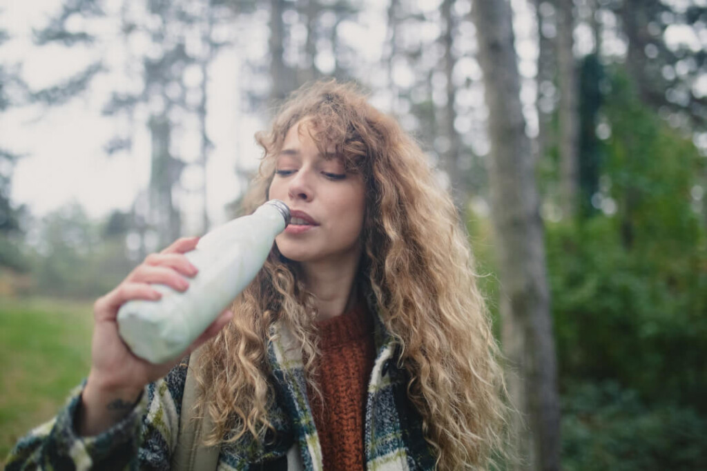
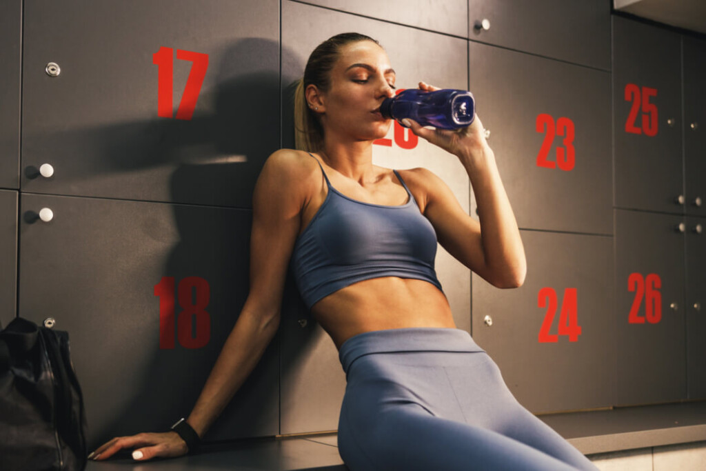
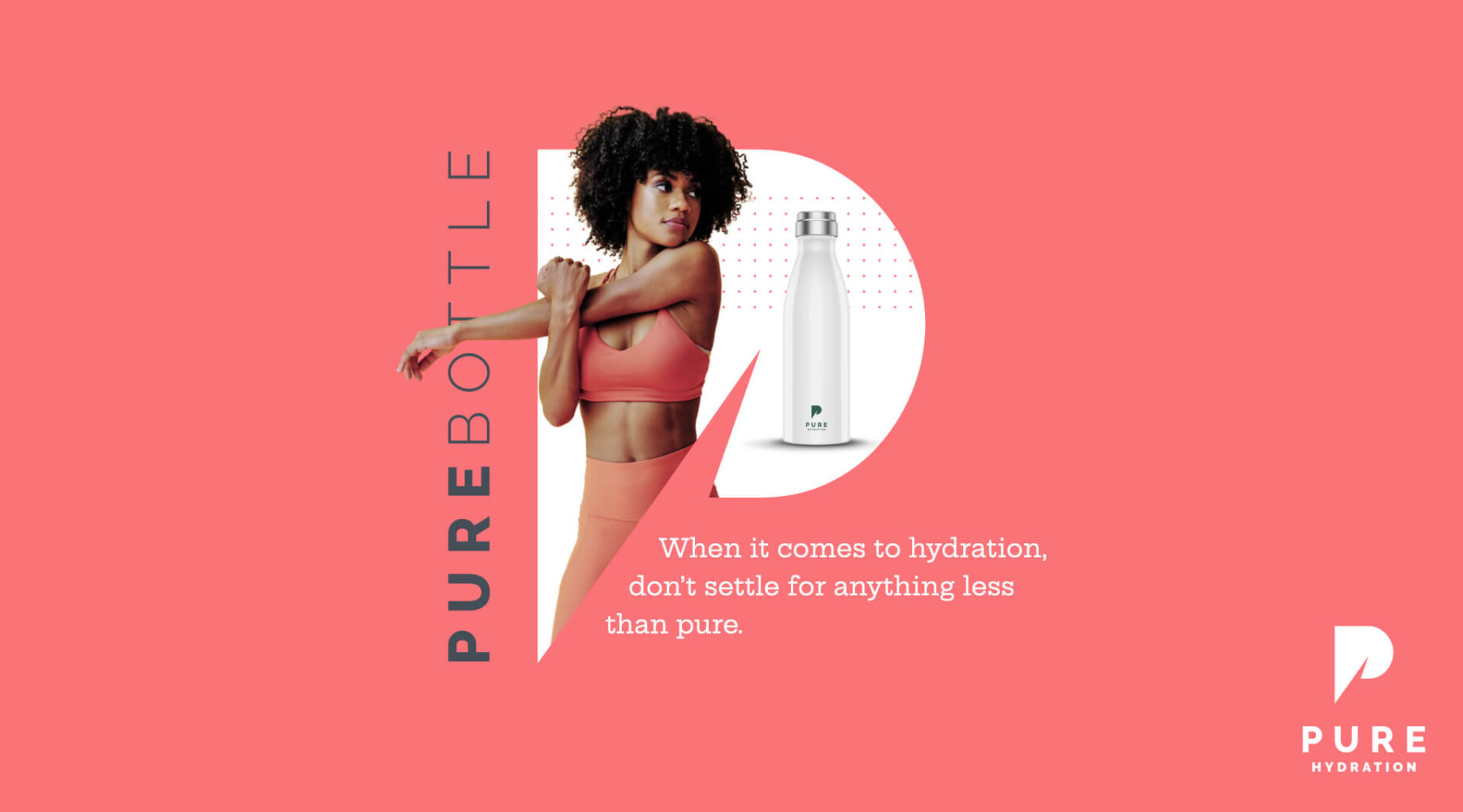
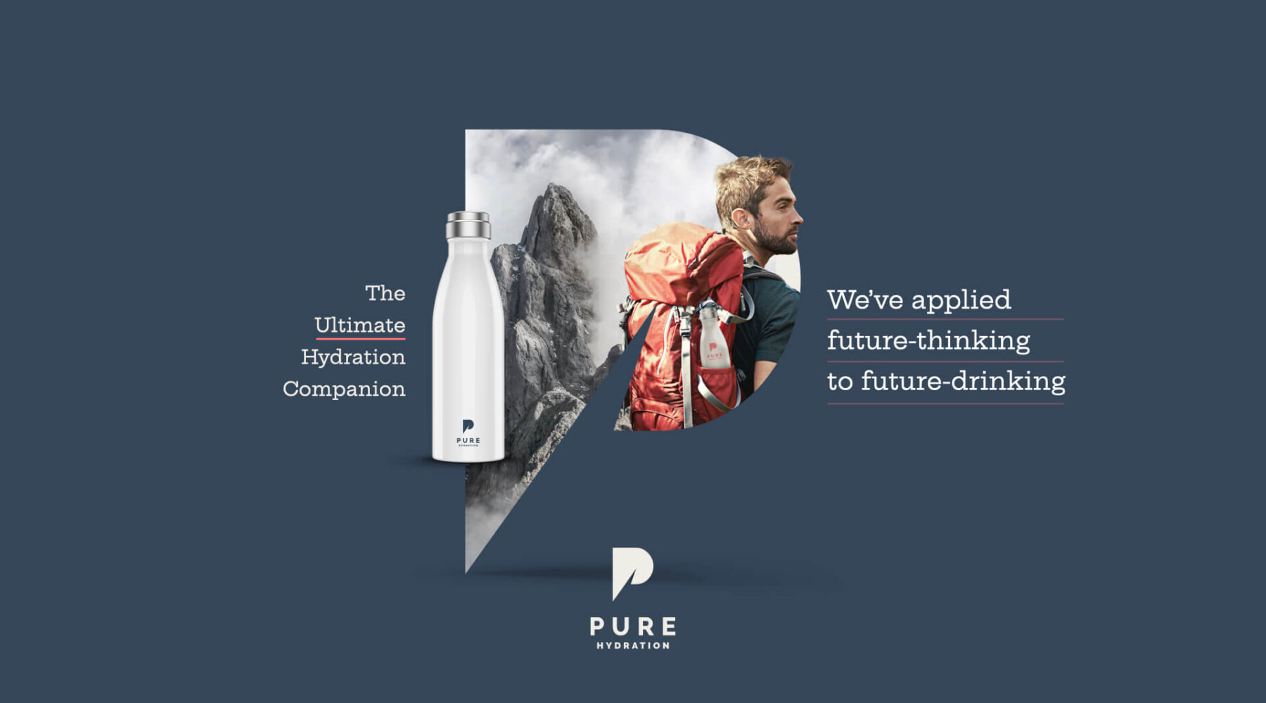
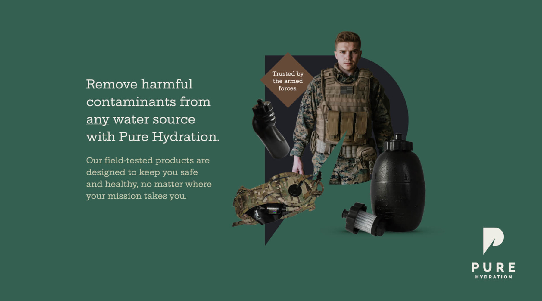
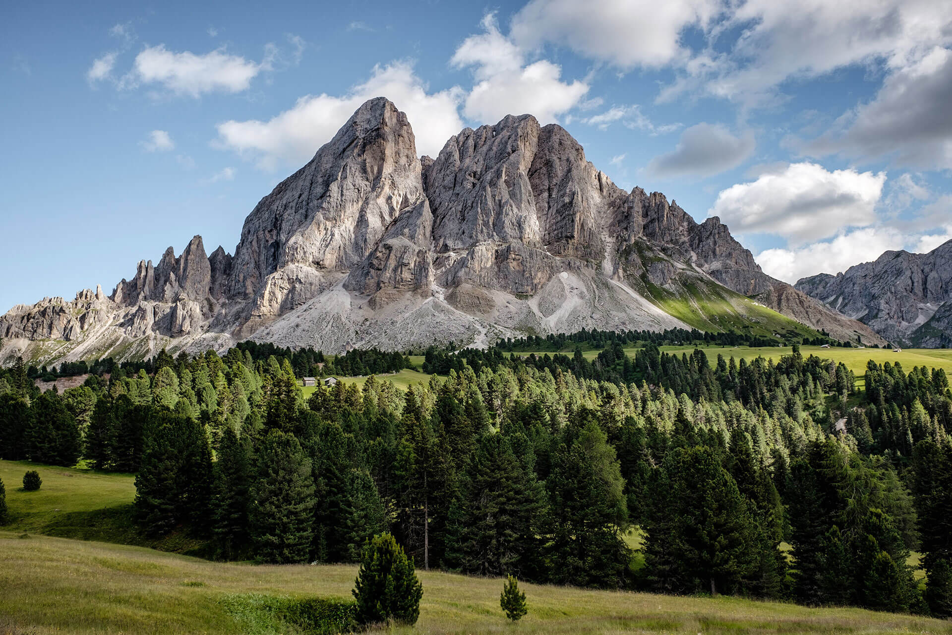
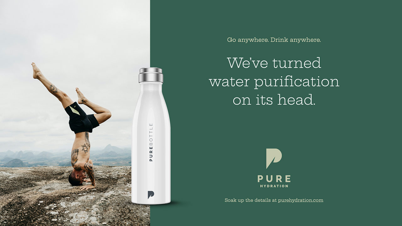
To appeal to diverse audiences while maintaining a cohesive brand, our strategy centered on a flexible creative platform. This consisted of collages combining graphic elements, targeted imagery, and product visuals that could be tailored to each key customer group. For example, marketing to outdoor enthusiasts might feature mountain landscapes, while campaigns for eco-consumers would showcase green living.
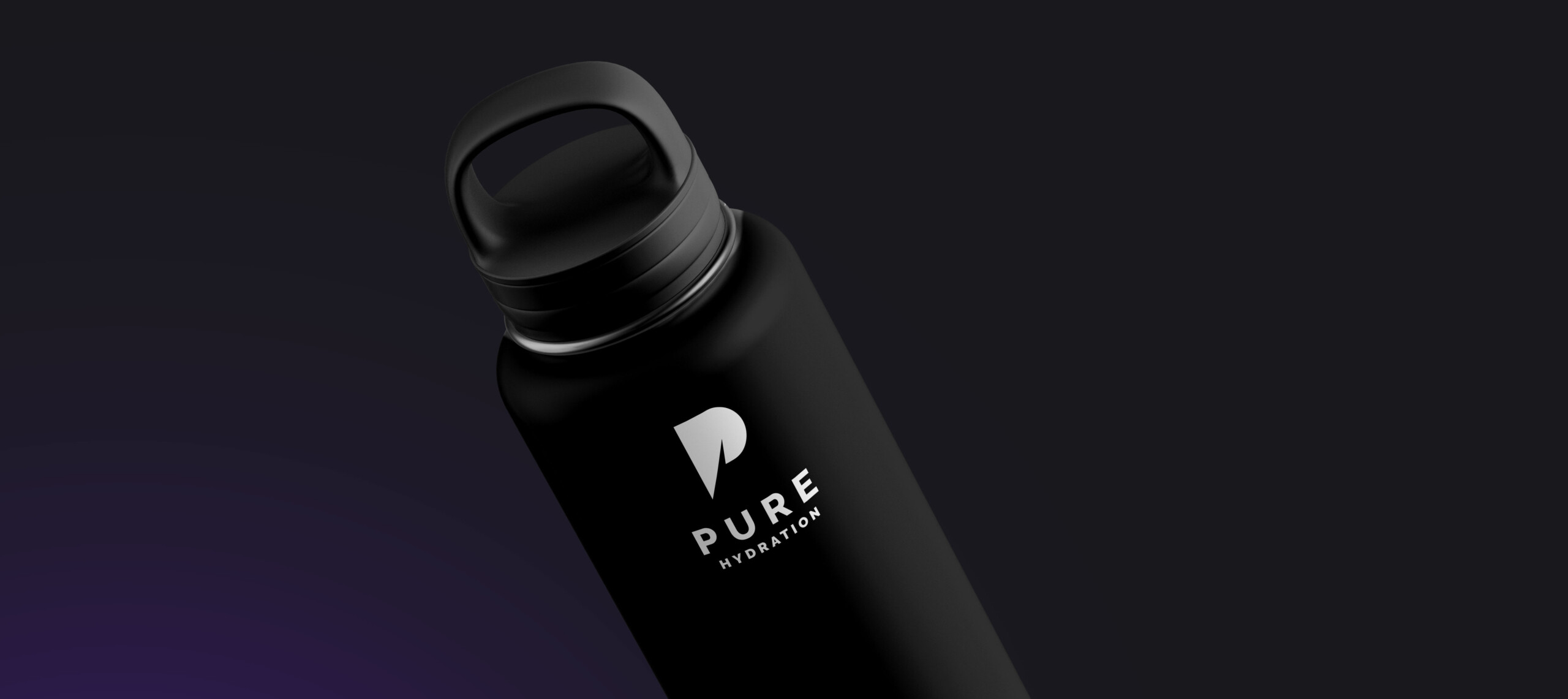
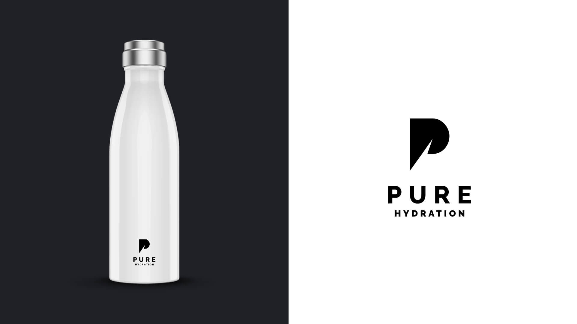
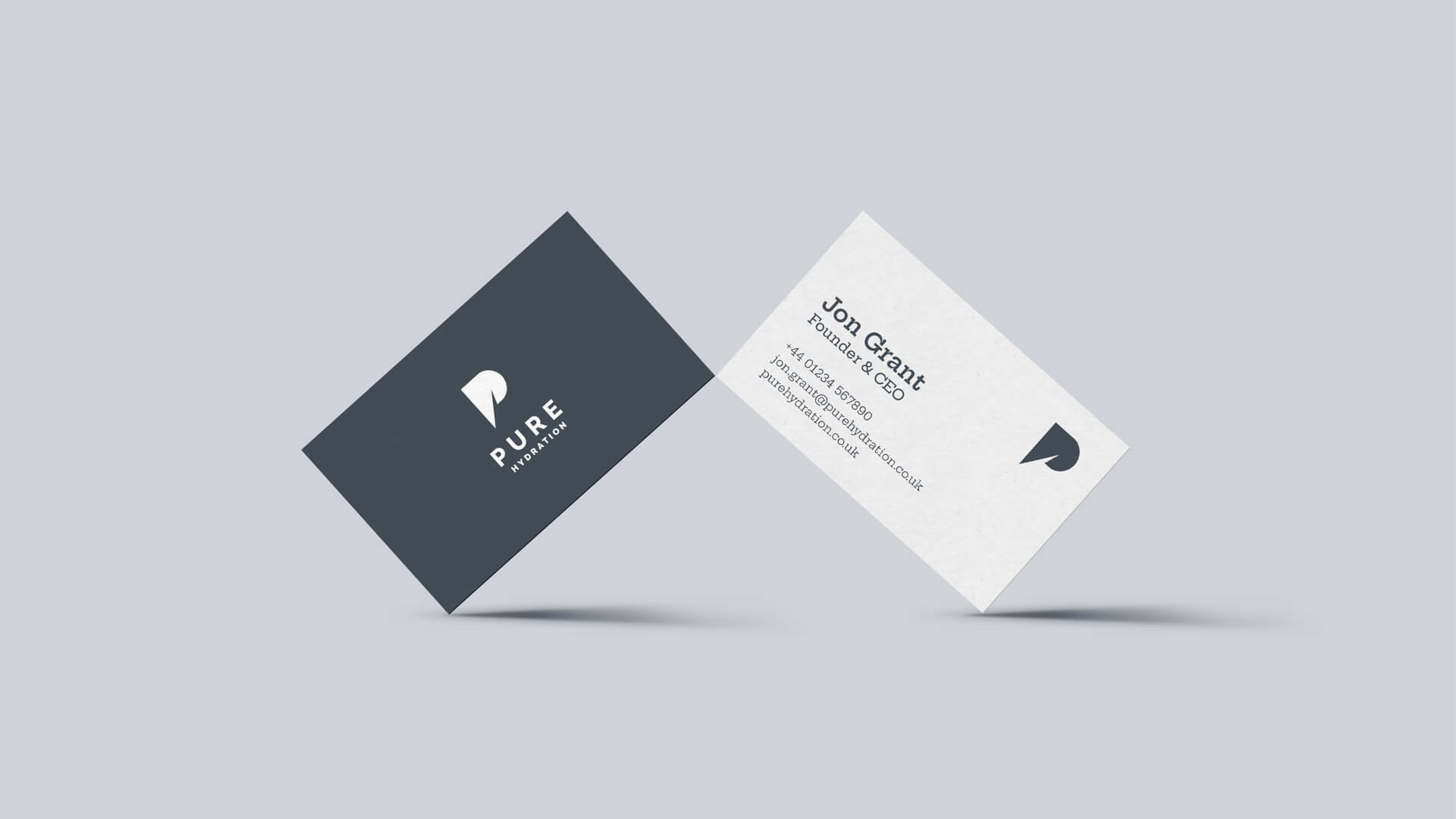
Tying these segmented creatives together is a bold, geometric monogram logo design. The logo’s crisp lines and angles reflect the advanced precision of Pure Hydration’s life-saving products.
This distinctive, self-assured mark provides an anchor point to build versatile campaigns around, while instantly signaling the brand’s authority on cutting-edge hydration technology.
Through this adaptable yet consistent approach, the branding strives to project confidence, purity, and an uncompromising spirit across all touchpoints.
BRAND IDENTITY REVITALISATION
From the output of a series of discovery workshops that explored the competitive landscape, defined Pure Hydration’s value proposition and identified key audiences, we were able to explore visual routes that bore the trusted, rugged characteristics of Pure’s humanitarian/military provenance and the consumer-friendly appeal of brands such as Chillys and Larq.
A REVAMPED CREATIVE PLATFORM
Pure now have a flexible design system of distinctive brand assets that can be brought together in montages to connect with specific audiences around the world – from climate-conscious Gen Zs, to mission-ready Special Forces operatives.
The simple, crisp geometry of the logo design creates a memorable brand mark that elevates Pure Hydration to the industry leaders they are. The monogram can be easily deployed at every brand touchpoint, and cements their presence on a wide variety of applications.
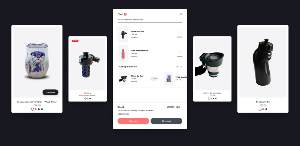
A SHOPIFY DESIGN MAKEOVER
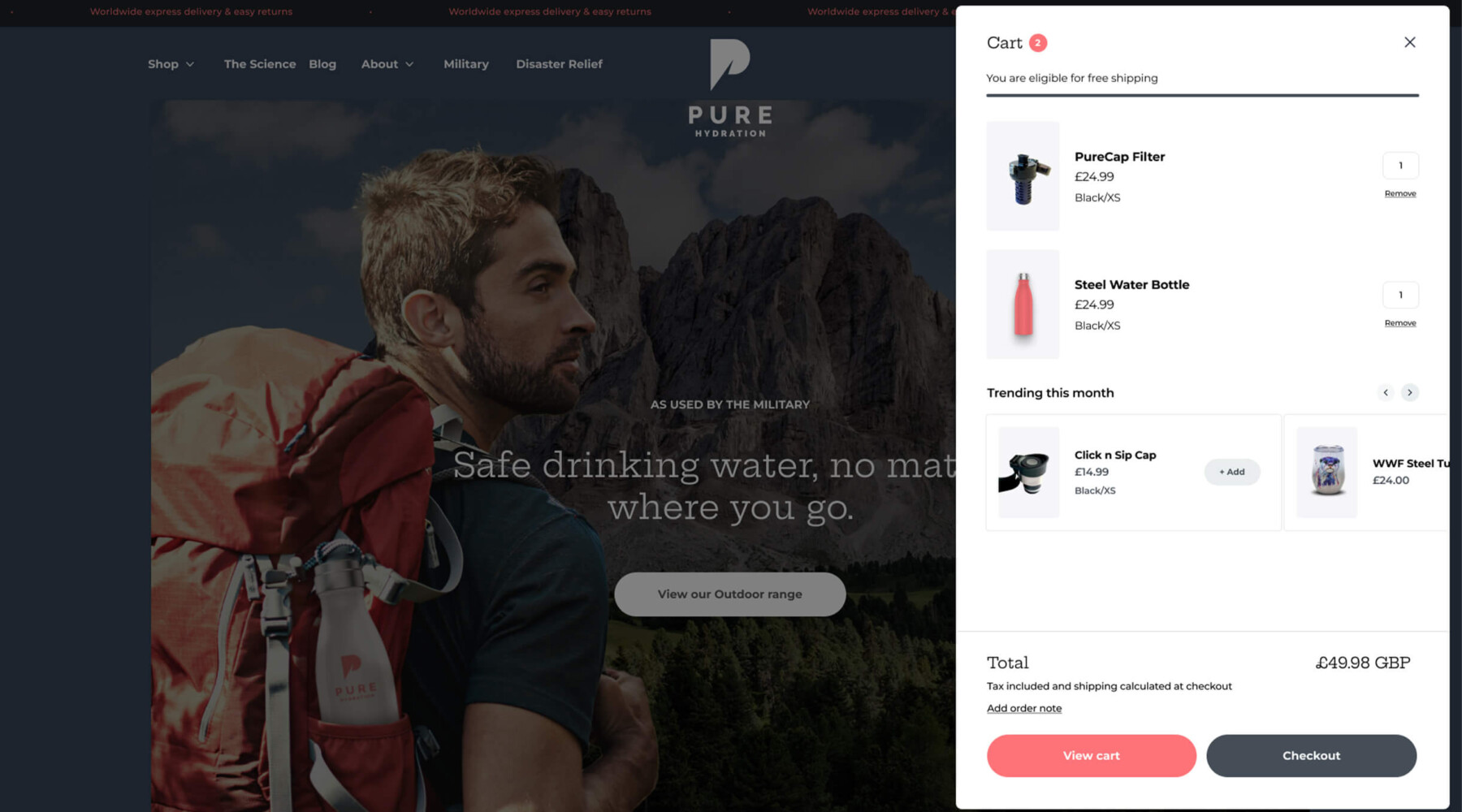
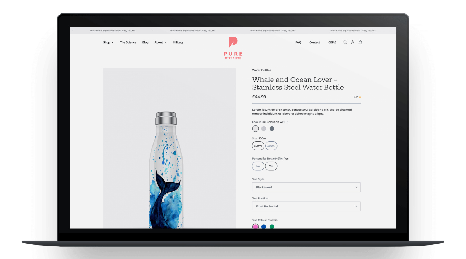
The new visual identity has been applied to their Shopify e-commerce website design, with a revamped theme that pours new life into the user experience. A streamlined site architecture shortens user journeys making it easier for them to find products and understand their benefits.
The addition of a blog provides Pure with a platform to boost topical authority and attract new visitors with SEO-friendly content that conveys their brand story and company values.

We can’t stop looking at our new site, we just love the look and feel of it. You have made us look like a million dollars, thank you!
PURE HYDRATION